How to add countdown to website and boost sales
Learn how to add countdown to website and boost conversions with a proven, urgency-driven strategy and actionable tips.
Want to add a countdown timer to your website? The easiest way I've found is to use a dedicated app that gives you a simple embed code.
This lets you build, style, and drop a timer right onto any page—whether it's a landing page, a product page, or even a blog post—all without touching a single line of code yourself. You just pick a look you like, set the deadline, and copy-paste the little code snippet into your site's HTML or a content block. Done.
The Real Reason Countdown Timers Drive Action
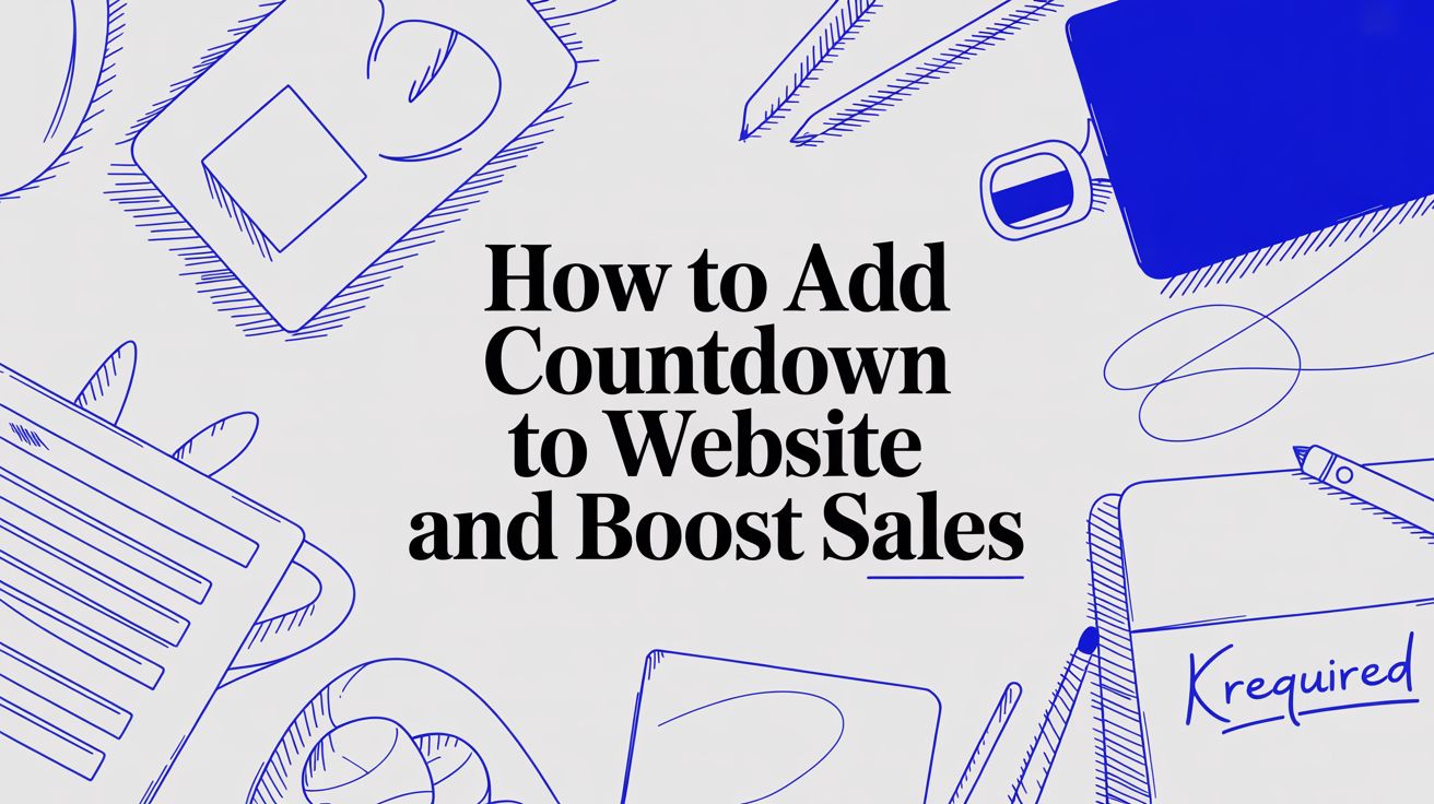
Ever wondered what makes a simple ticking clock so ridiculously persuasive? It’s not really about telling time. It’s about tapping directly into some deep-seated human psychology. Countdown timers are absolute powerhouses because they create a crystal-clear, can't-ignore-it sense of urgency.
That urgency flips a switch in our brains, triggering the fear of missing out (FOMO). It’s a primal motivator that pushes people to act now instead of putting it off. When a potential customer sees a great deal is about to vanish, their whole decision-making process kicks into high gear. The fuzzy idea of "maybe I'll come back later" gets replaced by a hard deadline that demands attention right away.
Turning Browsers into Buyers
Let's be honest, the modern web user has the attention span of a goldfish. The average session duration across all industries is a measly 2 minutes and 17 seconds, and people often spend less than a minute on any single page. You have a tiny window to make an impact.
A countdown timer is the perfect visual cue to cut through all the noise online. It grabs your visitor's attention and funnels it directly to your call-to-action. It's the difference between someone passively scrolling through your products and an active buyer frantically adding something to their cart before a flash sale disappears forever.
Key Takeaway: A countdown timer does more than just display time. It manufactures a decision-making moment, forcing visitors to evaluate an offer and act before the opportunity disappears.
Real-World Scenarios
This isn't just theory; this principle works across all sorts of business goals. I've seen it work time and time again.
Think about these situations:
- E-commerce Flash Sales: A timer ticking away next to the "Buy Now" button can massively spike sales for a 24-hour promotion. It’s a fantastic way to clear out old inventory.
- Webinar Registrations: Pop a countdown on your sign-up page. It stops people from thinking, "Oh, that's interesting, I'll sign up later," and then completely forgetting about it.
- Product Launches: Build serious hype by counting down to a new product release. This creates a ton of buzz and practically guarantees a flood of traffic on launch day.
By creating that finite window of opportunity, you instantly make your offer feel more valuable and exclusive. If you're looking for more ways to get customers excited, it's worth learning how to boost e-commerce customer engagement in other areas, too.
Ultimately, the goal is to give people a compelling reason to act now, a concept we dig into much deeper in our guide on how to create urgency in sales.
Picking the Right Countdown Timer for Your Campaign
When you're ready to add a countdown to your website, one of the first things you'll realize is that not all timers are created equal. The right choice really hinges on what you’re trying to achieve with your campaign. Picking the wrong one can be the difference between creating genuine excitement and just being annoying.
Think about it. A standard timer is your go-to for any event with a concrete deadline. This is perfect for things like a Black Friday sale that ends at midnight sharp or registration for a webinar that closes on a specific date. Every single person who visits your site sees the exact same time ticking away, creating a powerful, collective sense of urgency.
Then you have evergreen timers, which are a completely different beast. These are all about creating a personalized sense of urgency for each visitor.
Evergreen vs. Standard Timers
An evergreen timer, sometimes called a dynamic timer, kicks off the moment someone lands on your page. For example, you could set up a special "15-minute only" discount for every new visitor. It’s a fantastic way to nudge them toward an immediate purchase. This tactic is a secret weapon for automated funnels and lead magnets because it creates a unique, personal opportunity for every single person, no matter when they arrive.
So, how do you choose? It really comes down to the nature of your offer.
- Use a Standard Timer for: Events with a hard, public deadline. Think holiday sales, product launches, or ticket sales for a live event.
- Use an Evergreen Timer for: Automated welcome offers, limited-time access to a download, or personalized discounts that are triggered by a user's behavior.
Getting this distinction right is the foundation for a campaign that feels both urgent and authentic.
To make this even clearer, here's a quick table to help you match the right timer to your marketing goals.
Matching Countdown Timers to Your Marketing Goals
A quick comparison to help you select the most effective countdown timer for your specific business objective.
| Timer Type | Best For | Example Scenario | | :--- | :--- | :--- | | Standard Timer | Fixed-deadline events | "Our Black Friday sale ends in 2 days, 10 hours!" | | Evergreen Timer | Personalized, automated offers | "Welcome! Your exclusive 15% discount expires in 10:00." |
Ultimately, both are powerful tools, but they serve very different strategic purposes. Choose wisely!
Choosing the Right Display Style
Beyond the type of timer, where and how you display it is just as crucial. You don't want it to feel out of place.
A subtle timer tucked into an announcement bar at the top of your site is perfect for site-wide promotions. It keeps the offer top-of-mind as people browse around, but it doesn't scream at them. It's persistent without being intrusive.
On the flip side, a big, bold timer embedded right on a product page creates a much stronger focal point. This is the move for a flash sale on a specific item. You want to grab all the attention and make that limited-time deal impossible to ignore, directly influencing the purchase decision right then and there.
The magic happens when you match the timer's style and function to your campaign's goal. That's when you create a seamless and persuasive experience instead of a disruptive one.
At the end of the day, your choice should feel like a natural fit for your marketing objective. A well-chosen timer acts as a helpful reminder, not a pushy sales gimmick.
If you’re looking for more ideas on how to put these concepts into action, check out our guide on creating a free website countdown timer. It’s packed with even more examples and use cases. By understanding these small but important details, you can make sure your timer doesn't just grab attention—it actually drives action.
How to Set Up Your First Countdown Timer
Getting a timer live on your site is way faster and easier than you might think, especially with a dedicated app. Forget about wrestling with complex code—the goal here is to get you from a simple idea to a live, ticking countdown in just a few minutes.
I'll walk you through the process using a typical countdown timer app interface, so you can see just how straightforward it is.
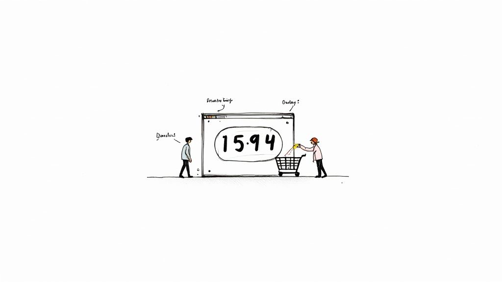
The very first decision you'll make is choosing the type of countdown you need. This choice is the foundation of your entire campaign strategy. Are you promoting a fixed-date event like a webinar, or are you creating a personalized offer for each visitor?
To help you decide, this decision tree breaks down the choice based on your primary goal.
As you can see, matching the timer's function to your marketing goal is the most important first step. It ensures your campaign feels authentic and actually works.
Configuring the Core Settings
Once you've picked your timer type, you'll land on the main configuration screen. This is where you’ll plug in the essential details that make your timer tick. Don't worry, the interface is designed to be super intuitive.
Here are the key settings you'll run into:
- Timer Type Selection: If you didn't choose upfront, you'll confirm whether it's a Fixed Timer (ending on a specific date and time) or an Evergreen Timer (which starts fresh when a new user visits).
- End Date and Time: For a fixed timer, this part is simple. You just pick the date and time from a calendar. Pay close attention to the timezone setting—you want to make sure it ends correctly for your target audience.
- Duration: For an evergreen timer, you'll set how long it runs for each person—for example, 15 minutes or 24 hours. This is the personal window of opportunity each visitor gets before their offer expires.
This initial setup dictates the entire logic of your timer. A small mistake here, like choosing the wrong timezone, can cause a sale to end prematurely. It’s definitely worth double-checking these details before you move on.
Pro Tip: When setting up an evergreen timer, think about the user journey. A short 10-minute timer might be perfect for a quick discount on a product page, but a longer 24-hour timer makes more sense for a downloadable resource sent via email.
Embedding the Timer on Your Website
After you’ve configured the timing and customized the look and feel, the final step is to add the countdown to your website. Most timer apps generate a small piece of code, often called a snippet or an embed code.
This might sound technical, but it's still incredibly simple. You don't need to understand what the code does, just where to paste it.
- Generate the Embed Code: Inside the app, look for a "Get Code" or "Embed" button. Clicking this will generate and automatically copy the HTML or script you need.
- Navigate to Your Website Editor: Log into your website's backend, whether that’s WordPress, Shopify, Squarespace, or another platform.
- Find the Right Location: Go to the page and the specific section where you want the timer to show up.
- Insert the Code: Look for an "HTML," "Custom Code," or "Embed" block in your website editor. All you have to do is paste the code snippet you copied right into this block.
Most modern website builders, like HubSpot or Squarespace, offer a "Rich Text" or "Embed" module specifically for this. You just add that module to your page and drop the code directly inside.
Once you hit save or publish, your timer will appear exactly where you placed it, fully functional and styled just the way you designed it. It’s a seamless process that connects the timer you built in the app directly to your live site, ready to start creating urgency and driving conversions.
Customizing Your Timer to Match Your Brand
Okay, you've got your timer set up and the clock is ticking. Now for the fun part: making it actually look like it belongs on your website.
A generic, out-of-the-box timer can feel jarring, almost like an unwanted pop-up. It can disconnect from your brand and undermine the very urgency you're trying to create. The goal here is a seamless visual experience where the timer enhances your page, not distracts from it.
Think of it like your logo or brand colors—it's another piece of your brand identity. A well-integrated timer builds trust. A mismatched one? It can look unprofessional, even a bit spammy. That’s why spending a few extra minutes on customization is so important when you add a countdown to your website.
Aligning Colors and Fonts with Your Brand
The easiest win is getting the colors right. You want the timer to blend in perfectly with your established brand palette. Most timer apps give you intuitive color pickers to dial in the exact shades you need.
Here’s a quick breakdown:
- Background Color: Match this to your site's section color for a subtle, blended-in feel. Or, if you want it to stand out, use a contrasting brand color that pops without clashing.
- Digit Color: Readability is everything. Use a bold, high-contrast color from your palette that stands out against the timer's background.
- Label Color: The text for "Days," "Hours," etc., should also be clear, but you can get away with a more subdued, secondary brand color here.
Typography is just as crucial. If your website uses a specific font family, like Montserrat for headings and Lato for body text, your timer should follow suit. This kind of consistency is what gives your entire page that polished, professional look.
Your goal is visual harmony. The timer should draw the eye because of the urgency it creates, not because it looks like a foreign object that was just dropped onto your page.
Crafting a Compelling Call to Action
The text you pair with your timer is a critical piece of the puzzle. The countdown creates the why now, but your copy needs to provide the what and the how. Your message should be short, punchy, and drive home the benefit.
Instead of a generic "Sale Ends Soon," get specific and make it compelling:
- "Your 50% Discount Vanishes In:"
- "Claim Your Spot Before Registration Closes In:"
- "Last Chance for Free Shipping! Offer Ends In:"
This microcopy is what connects the timer's ticking clock directly to a valuable action. It transforms the timer from a simple clock into a persuasive marketing tool.
Optimizing Size and Layout for All Devices
Finally, don’t forget about mobile. A huge, bold timer that looks amazing on a desktop might completely overwhelm a mobile screen, pushing your actual content out of view.
Responsive design is key. Good timer apps will handle this automatically, but you should always preview it yourself. You want the timer to be easily readable on a small screen without taking up more than a third of the viewport. Proper sizing makes for a great user experience, and that's essential for getting conversions.
For a deeper dive, our guide on creating a customizable countdown clock offers even more advanced tips to get this just right.
Placing Your Timer for Maximum Conversion Impact
Where you decide to add a countdown to your website is just as critical as its design. You can have the most beautiful, brand-aligned timer in the world, but if it’s buried where no one sees it, it won’t do a thing.
Placement is pure strategy. It's about getting inside your customer's head, understanding how they browse your site, and putting the timer in a high-impact zone that nudges them toward a decision.
Think of it this way: the timer's location gives it context. A timer in one spot might build anticipation, while in another, it pushes for an immediate purchase. The right placement makes sure your message of urgency hits at the perfect moment in the customer journey. It’s all about making smart choices so your timer gets seen and, more importantly, acted upon.
The Top Announcement Bar
One of the most effective and popular spots is the top announcement bar, sometimes called a "hello bar." This is the perfect home for site-wide promotions, like a holiday sale or a free shipping deadline.
Because it sits at the very top of every single page, it offers persistent visibility without being obnoxious. As visitors navigate from your homepage to product pages, that ticking clock stays with them, constantly reinforcing the offer's urgency no matter where they end up.
High-Impact Product Page Placements
When your goal is to sell a specific item, putting the timer right on the product page is a no-brainer. I've found that positioning it right next to the "Add to Cart" button creates a powerful psychological link between the product and the limited-time offer. It's an incredibly direct approach.
This tactic works wonders for:
- Flash Sales: Highlighting a temporary price drop on a popular item.
- Limited Inventory: Using a timer to show when a low-stock item might be gone for good.
- Next-Day Shipping: Displaying a cutoff time to secure fast delivery.
This placement cuts through the hesitation by focusing the user's attention on making an immediate decision. That visual pressure from the ticking clock can be the final nudge a customer needs to buy now instead of leaving to "think about it."
Industry studies have shown that well-executed countdown timers can increase conversion rates by anywhere from 9% to 40%. The key is that the urgency must be genuine—a real flash sale with a hard stop or a valid shipping deadline. Fake scarcity kills trust fast.
Checkout and Exit-Intent Placements
The checkout page is another piece of prime real estate. A timer here can be your secret weapon against cart abandonment by reminding shoppers that their special price or bundled offer is about to expire. It's a last-ditch effort to seal the deal.
Similarly, dropping a timer into an exit-intent popup can be a game-changer. Just as a user is about to leave your site, a popup with a special, time-sensitive offer can be enough to pull them back in. It’s your final opportunity to present an irresistible deal.
To make sure your timer is part of a winning strategy, it's smart to explore broader conversion rate optimization best practices to get the full picture for making these high-stakes decisions.
How to Use a Countdown Timer Without Losing Customer Trust
A countdown timer is a powerful tool, but let's be honest—using it the wrong way is one of the quickest ways to torpedo your brand's credibility. When you add a countdown to your website, you're making a promise to your customers. If you break that promise with shady tactics, you risk damaging that trust for good.
The biggest offender? The endlessly resetting timer. We've all seen it. A "limited-time" offer that magically starts over every time you refresh the page or clear your cookies. This doesn't create real urgency; it just screams that your brand is being dishonest. Your customers are savvy, and they'll spot a fake deadline from a mile away.
Don't Fall into the Pressure-Selling Trap
Another huge misstep is cranking up the pressure so high that customers feel cornered rather than excited. An aggressive, in-your-face timer paired with alarming language can make your brand feel desperate and untrustworthy.
This very issue has landed major retailers in some serious hot water. A well-known case involved the fashion retailer Boohoo Group, which faced an investigation for using timers that didn't expire as advertised. This is a classic example of 'pressure selling', a tactic that can lead to customer anxiety and a spike in returns. You can read more about it in this analysis of retail countdown clock practices.
The goal is to create helpful urgency, not stressful anxiety. Your timer should feel like a friendly reminder of a genuine opportunity, not a high-pressure sales tactic designed to force a decision.
Authenticity is everything. Your timer needs to reflect a real deadline for a legitimate offer. If the sale really ends at midnight, that timer has to hit zero and stop. If you have limited stock, the offer needs to disappear when it's all gone.
Here are a few things you absolutely want to avoid:
- Fake Scarcity: Don't claim "only 3 left!" when your warehouse is full.
- Resetting Timers: Avoid using "evergreen" timers that masquerade as fixed-date sales.
- Constant Urgency: Running back-to-back "emergency" sales just makes them all feel less important.
By sidestepping these traps, you build a strategy that fosters long-term loyalty. An honest approach respects your audience, making them feel good about their purchase and excited to come back.
Ready to create a countdown timer that builds excitement and trust? The Countdown Timer App makes it easy to design and embed beautiful, effective timers for your website and social media. Start for free and see how simple it is.


