Build a Customizable Countdown Clock That Converts
Discover how a customizable countdown clock can boost conversions and urgency on your site. Quick setup tips, proven formats, and optimization ideas.
A customizable countdown clock isn't just a widget; it's a powerful marketing tool designed to create urgency, stir up a little scarcity, and nudge users to take action. By putting a ticking timer on a sale, launch, or event, you tap directly into the psychology of FOMO (Fear Of Missing Out) and speed up your customer's decision-making process.
Why Countdown Clocks Are a Secret Conversion Weapon
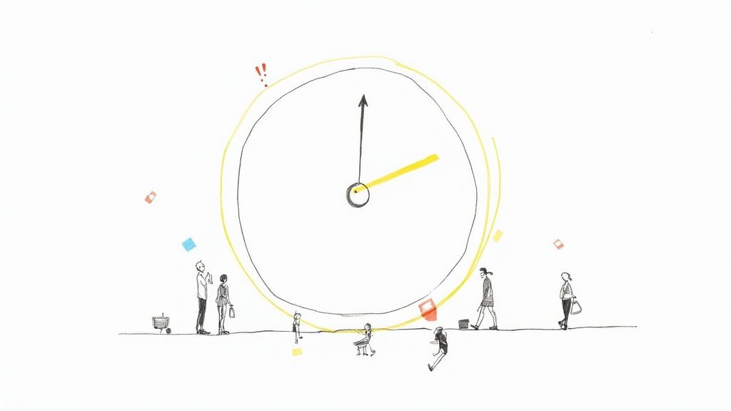
Ever found yourself frantically buying concert tickets or grabbing a limited-edition item just before it sold out? That little kick of adrenaline is exactly what a countdown clock brings to your website. It’s not just a digital timepiece; it's a strategic move that turns casual browsing into decisive action.
This simple psychological nudge can drive some pretty serious business results. When people see that time is running out, they're far more likely to make a purchase, sign up for a webinar, or download that resource they were on the fence about. Procrastination goes out the window, and action takes over.
The Psychology of Urgency
At its heart, a customizable countdown clock plays on two powerful human motivators:
- Urgency: The timer creates a hard deadline, clearly signaling that an opportunity is temporary. This forces an immediate evaluation from potential customers who might otherwise put it off for later.
- Scarcity: As the clock ticks down, the perceived value of your offer skyrockets. Whether it's a short-lived discount or a product launch, the timer emphasizes that the chance to get it is finite.
A well-placed timer does more than just count down the seconds. It frames your offer as an exclusive, time-sensitive event that shouldn't be missed. It effectively shifts a user's mindset from "I'll think about it" to "I need to act now."
Real-World Impact on Conversions
The impact of this strategy isn't just theoretical—it's tangible and easy to measure. So, where do these timers really shine? I've seen them deliver the best results in a few key areas.
Where Countdown Timers Deliver the Best Results
| Application | Primary Goal | Ideal Placement | | :--- | :--- | :--- | | Flash Sales | Drive quick revenue spikes | Homepage banner, product pages | | Webinar Registrations | Boost sign-ups before the event | Landing pages, email invitations | | Product Launches | Build anticipation and initial sales | "Coming Soon" pages, social media | | Holiday Promotions | Capitalize on seasonal buying | Sitewide headers, category pages | | Limited-Time Offers | Increase lead generation | Pop-ups, exit-intent overlays |
These are just a few scenarios, but you can see how a timer adds that extra push exactly where you need it most.
Businesses regularly report significant boosts in conversions when they use timers for promotional campaigns. An e-commerce store running a 48-hour flash sale, for instance, can stick a timer right on its homepage to make sure every visitor knows the clock is ticking. This one addition can dramatically increase sales by constantly reminding shoppers that the deal won't be around forever.
For a deeper look into maximizing user action on your site, checking out these tips to improve website conversions can give you some broader strategies that work great alongside a countdown clock.
Designing a Timer That Grabs Attention
Let’s be honest, a countdown clock only works if it feels like a natural part of your brand, not some generic widget you just dropped onto the page. This is where good design comes in. It’s the difference between a timer that’s compelling and one that’s just plain distracting.
When your countdown timer blends seamlessly with your website or email, it reinforces your message instead of clashing with it. Think about it—this visual harmony builds trust and makes the sense of urgency feel authentic. A poorly designed timer, on the other hand, can look out of place and cheapen your entire offer.
Aligning Your Clock with Your Brand Identity
First things first: brand consistency. Your timer should look and feel like it belongs to you. Treat it like any other branded asset, right alongside your logo and brand imagery.
Start by matching the core visual elements. If you have a sleek, minimalist brand, a clean and modern font is the way to go. But if your brand is more playful and vibrant, you can get away with bolder colors and a more expressive typeface.
Here are the key things to dial in for a cohesive look:
- Colors: Pull from your primary and secondary brand colors. Just make sure you pick a high-contrast combination for the background and numbers so readability is never an issue.
- Fonts: Choose a font that matches your website's typography. Most tools, including the Countdown Timer App, offer a solid selection of web-safe fonts or let you use standard system fonts.
- Background: Do you want a solid color, or would a transparent background that lets your page design show through work better? You could even use a custom image to really drive your promotion home.
Sizing and Placement for Maximum Visibility
Where you stick your countdown clock and how big you make it can completely change its performance. The goal is to be noticeable without being obnoxious. You want it to command attention, but not at the expense of the user's journey.
For a website, placing the timer "above the fold"—the part of the page you see without scrolling—is almost always the right move. I've found the highest-impact locations are usually in a sticky header bar, right below the main hero image, or next to a call-to-action button.
Pro Tip: Make your timer responsive. A clock that looks perfect on a desktop can become a jumbled, unreadable mess on a mobile screen. Always, always preview your design on different devices to make sure it scales correctly.
The ideal size really depends on where it lives. A timer in a header bar needs to be compact, while one on a dedicated landing page can be much larger and more prominent. You want it to be impossible to miss without it totally overwhelming the rest of your page.
A well-designed customizable countdown clock doesn't just count down; it enhances your message and creates a powerful visual cue that gets people to act.
Building Your First High-Impact Countdown Clock
So you want to create a high-impact, customizable countdown clock? It’s surprisingly simple, especially with no-code tools like the Countdown Timer App. The best part is you don’t need to be a developer to build something that looks polished and gets people to act. The entire process is visual, so you can see exactly what you’re creating in real time.
This hands-on approach puts you in the driver's seat, letting you tweak everything from the timing mechanics to the final look and feel. It’s all about creating something that feels like a natural part of your campaign, whether you're hyping a flash sale, a webinar, or a big product launch.
Choosing Your Starting Point
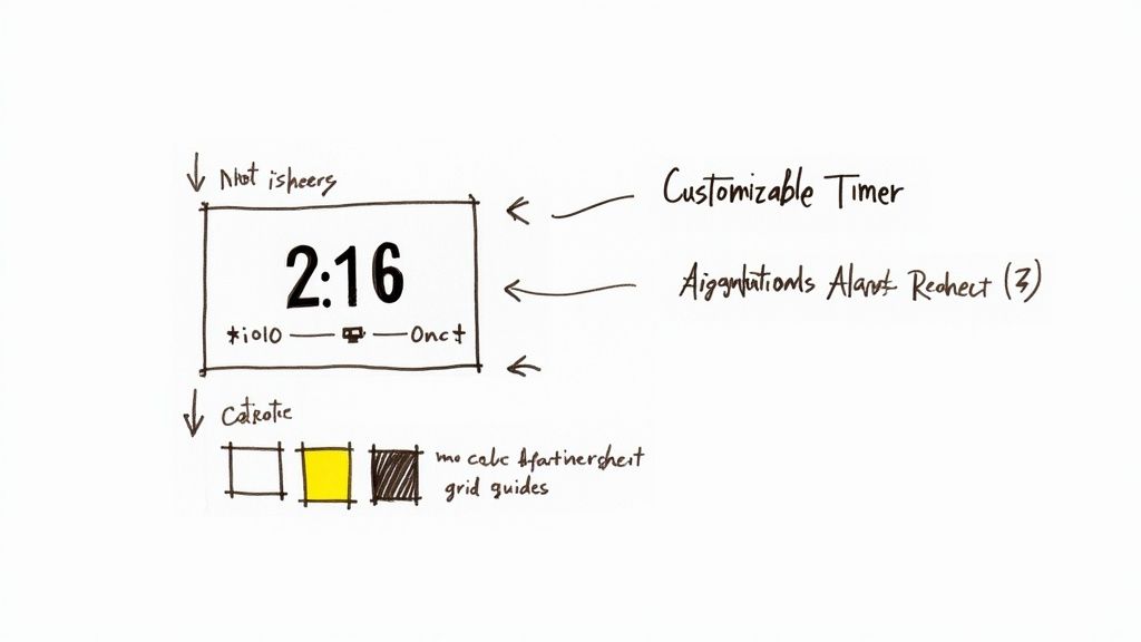
Your first decision is always the most important one: picking a template. A good template gives you a solid foundation to build on, offering a pre-designed layout you can tailor to your needs. Trust me, this is way faster than staring at a blank canvas.
Instead of getting lost in the minor details right away, a template lets you focus on the bigger picture. Think about the overall vibe you're going for. Do you need a sleek, simple bar-style timer for your website header? Or maybe a larger, more attention-grabbing block for a landing page?
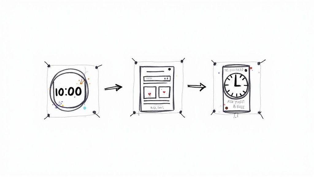
Here’s a quick visual of how the initial setup usually flows—you pick a template, set your date, and then jump into styling.
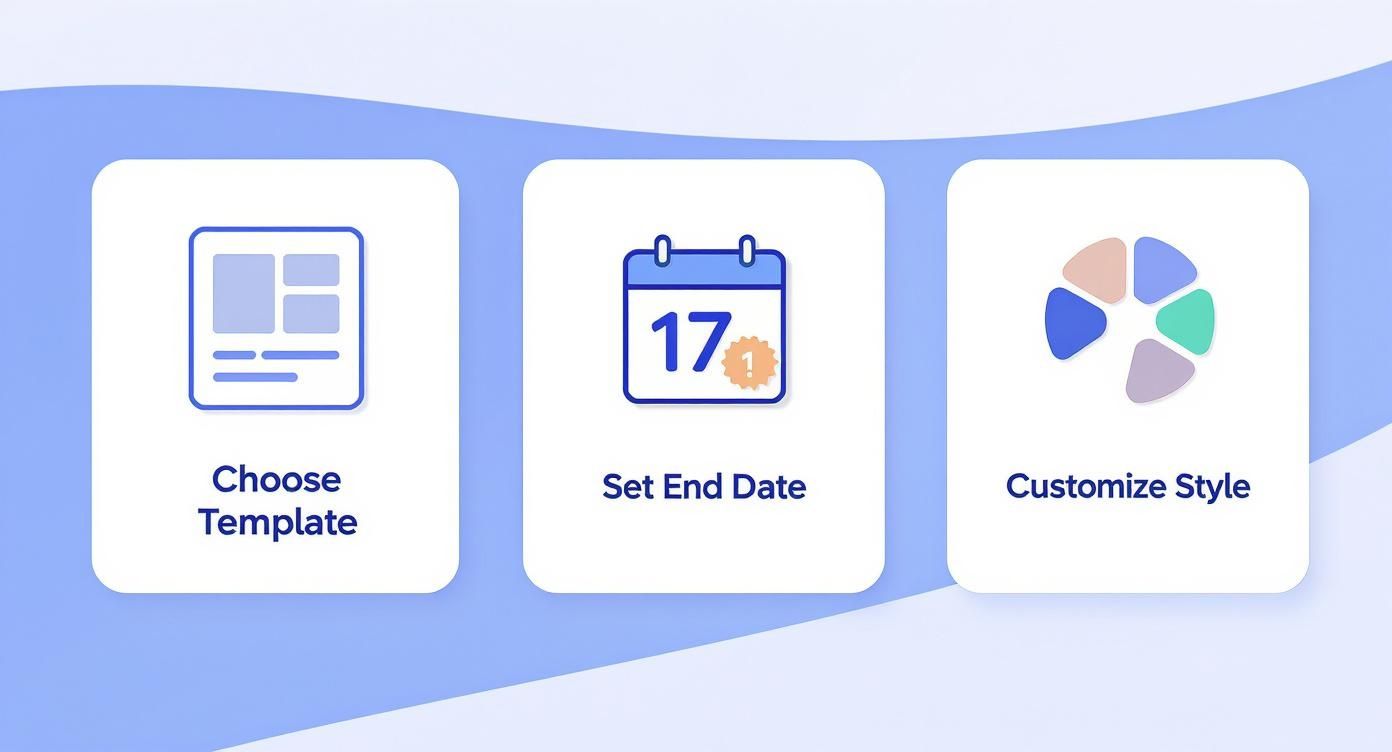
As you can see, starting with a template streamlines the whole process. It gets you to the fun part—customization—much quicker, so you can focus on making the timer your own.
Setting the Core Timer Details
Once you’ve got your template, it’s time to configure the most critical element: the end date and time. This is what gives your countdown its purpose. Be precise here—if your sale ends at the stroke of midnight, make sure your timer reflects that exactly.
Most tools will give you two main options for how the timer runs:
- Fixed End Date: This is your classic countdown to a specific moment in time (e.g., "Sale ends on Black Friday at 11:59 PM"). It’s the same for every single person who sees it.
- Evergreen (or Personalized) Timer: This one is a bit more clever. It starts counting down for each visitor individually the first time they land on your page. It’s perfect for creating genuine urgency in automated sales funnels.
The real magic happens when you decide what the clock does after it hits zero. My go-to strategy for sales is to have the offer and the timer completely disappear. This powerfully reinforces scarcity and trains your audience to act faster next time.
For more ideas on how to use timers across different platforms, check out our guide on creating a free website countdown timer, which is packed with different use cases.
The technology behind these timers has come a long way. The market for digital timers is growing fast, thanks to smart home tech and a bigger focus on energy efficiency. People now expect slick features like remote control and flexible scheduling, which has pushed the whole industry forward. You can learn more about the latest developments in digital timer technology.
Customizing the Visuals to Match Your Brand
With the timer logic all set, it's time for the fun part: making it look good. This is your chance to inject your brand's personality into the clock, ensuring it complements your website's design instead of clashing with it.
Your main goals during this stage are pretty straightforward:
- Brand Consistency: Use your brand’s exact color palette and fonts. You want it to look like it belongs.
- Readability: Make sure the numbers are big, bold, and easy to read. High contrast against the background is a must.
- Call to Action: Don't forget to add a punchy message and a clickable button to tell users what to do next.
Once you’re happy with the design, you’re ready to publish. Most apps will give you a simple embed code that you can copy and paste directly into your website's HTML. This makes the final launch process quick and totally painless.
Where to Place Your Timer for Maximum Effect
Designing a sharp, on-brand countdown timer is only half the job. If nobody sees it, all that creative effort is for nothing. The real magic happens with strategic placement—putting your timer right where your customers are making decisions. Think of it like prime real estate in a shopping mall; visibility is everything.
A timer's power is all about context. When you place it in the right spot at the right time, the urgency feels natural and compelling, not pushy. Your goal is to weave the countdown into the customer's journey, nudging them toward the action you want them to take.
On Your Website's High-Traffic Zones
Your website is the perfect place to build a little FOMO, and some pages will give you more bang for your buck than others. Dropping a countdown clock in these high-traffic areas guarantees maximum exposure and can seriously boost conversions. For a flash sale, a sitewide banner at the very top of every page is impossible for visitors to ignore.
Here are a few key spots to consider for your website:
- Homepage Banner: This is your welcome mat. A timer here instantly signals that something important and time-sensitive is happening.
- Product Pages: Placing a timer right next to the "Add to Cart" button can be that final nudge a hesitant shopper needs to pull the trigger.
- Landing Pages: Got a dedicated campaign for a webinar or a new product launch? A big, bold timer keeps the focus squarely on the deadline.
If you need a hand with the technical side, our guide on how to embed a countdown timer in a website breaks it down step-by-step.
Don't bury your timer! Placing it "above the fold"—the part of the page you see without scrolling—is non-negotiable. Studies show that content placed here gets 84% more attention, making it the most valuable digital real estate you own.
Injecting Urgency into Email Campaigns
Email is still a marketing powerhouse, and a live countdown clock can make your campaigns pop in a sea of boring inboxes. Instead of just telling subscribers "Sale ends tonight," you can actually show them. That visual, ticking clock creates a real-time sense of urgency that plain text just can't replicate.
When you add a timer to your emails, think about the context. They work wonders for:
- Last-Chance Reminders: Send an email 24 hours before a promotion ends with a live timer ticking down. It’s incredibly effective.
- Cart Abandonment Flows: Gently remind shoppers that their special discount is about to expire.
- Event Invitations: Drum up excitement for a webinar or live stream by showing exactly how little time is left to register.
This simple addition turns a standard email into an interactive, time-sensitive experience, pushing subscribers to click through and act before the clock hits zero.
Advanced Strategies to Get Better Results
Okay, so you've got the hang of creating a basic countdown clock. Now it's time to dig into the really powerful stuff—the strategies that turn a simple timer into a serious conversion machine.
When you move beyond a one-off flash sale, you open up a whole new world of automation and optimization. These aren't just cosmetic tweaks; these are advanced tactics designed to create smarter, more personal reasons for your visitors to act now.
Create Personalized Urgency with Evergreen Timers
One of the most effective tools in your marketing toolkit is the evergreen timer.
Forget the standard, fixed-date countdown that ends for everyone at the same time. An evergreen clock is different. It starts a unique countdown for each person the moment they land on your page. This is how you create genuine, personal urgency that works for you 24/7, making it a perfect fit for automated sales funnels or welcome sequences.
Imagine a new subscriber signs up for your newsletter and gets a welcome email with a special 24-hour discount. With an evergreen timer, that 24-hour clock starts ticking for them and them alone. It doesn't matter when they signed up; every single person gets that same powerful nudge to take action.
You can learn more about the technical side of this in our detailed guide on how to make timers for different platforms. Trust me, it's a game-changer for building campaigns that scale without losing that personal touch.
Here's the bottom line: Evergreen timers make urgency personal and scalable. Instead of one big launch, you can create countless individual moments of high-intent action, which is huge for improving conversions in any automated system.
The technology that makes this possible is only getting better. The global market for real-time clocks (RTCs)—the tech that ensures these timers are accurate—was valued at USD 2.776 billion in 2024. It's projected to nearly double by 2031, which means the tools we rely on will just keep getting more precise.
Fine-Tune Your Timers with A/B Testing
So, what works better: a red timer or a green one? A banner at the top of the page or a clock right next to the "Buy Now" button?
Don't guess. Test it.
A/B testing is how you stop making assumptions and start making data-driven decisions to maximize your timer's impact. It's simple to set up. Just create two versions of your page with one small difference in your countdown clock.
For example:
- Version A: A big, bold timer with a solid red background.
- Version B: A smaller, more subtle timer with a transparent background.
Send half your traffic to Version A and the other half to Version B. After a while, you'll have real data showing which design drove more clicks and sales. This is exactly how you dial in your strategy.
For anyone serious about optimization, consistently using split testing with A/B testing is a must. It removes the guesswork and ensures your customizable countdown clock is working as hard as it possibly can for your business.
Answering Your Top Countdown Clock Questions
When you start digging into countdown timers, a few key questions always seem to surface. I've been there. Getting these answers straight from the beginning can save you a ton of headaches and make sure your timer actually helps, not hurts, your marketing.
Let's clear up some of the most common things people ask.
Will a Countdown Clock Mess Up My Website’s SEO?
Short answer? Nope, not if you use a good one.
A well-built countdown timer from a reputable source is designed to be super lightweight. It shouldn't slow your page down in any noticeable way. Modern search engines are smart enough to handle dynamic elements like timers without batting an eye.
The main thing is to stick with a trusted tool that’s been optimized for performance. After you install your timer, it never hurts to run a quick page speed check just for peace of mind. Honestly, the bump in conversions you get from that little bit of urgency almost always blows any tiny performance impact out of the water.
What’s the Difference Between a Fixed and an Evergreen Timer?
This one is huge. Getting this right is fundamental to your entire strategy because these two timers serve completely different purposes.
- Fixed Timer: Think of this as a public, one-time event. It has a single end date that’s the same for absolutely everyone. This is your go-to for big, public deadlines like a Black Friday sale, a product launch, or a live webinar. Everyone sees the exact same clock ticking down.
- Evergreen Timer: This timer is all about personalization. It starts counting down the moment an individual user lands on your page. For example, you could set up a "Your Special 24-Hour Offer" that kicks off for every new visitor. It’s an automated urgency machine that works 24/7.
Evergreen timers are absolute gold for automated funnels. They give every single person who enters your sales process that same gentle push, no matter when they show up.
A fixed timer creates a shared, public event. An evergreen timer creates a private, personal one. Use fixed for launches, evergreen for automated marketing.
What Should Happen When My Countdown Hits Zero?
Don't forget to plan for the big finish! What happens when the clock runs out sends a powerful signal to your audience about how serious you are about your deadlines.
You’ve got a few solid options:
- Make the Offer Vanish: The timer and the special deal disappear completely. This is the most powerful way to enforce scarcity. It trains people to act fast the next time they see one of your timers.
- Redirect Them: Automatically send visitors to a different page. This could be a waitlist for the next sale, a blog post, or a page with a different, non-discounted offer.
- Show a "Time's Up" Message: The simplest option. Just replace the timer with a note saying the promotion has ended.
For driving sales, hiding the offer is almost always the winner. It proves your deadlines are legit and builds massive credibility for all your future promotions.
Ready to build a customizable countdown clock that gets people to take action? The Countdown Timer App lets you design and launch beautiful, high-impact timers on your website or Facebook page in just a few minutes.


