Customize Countdown Clock for Maximum Impact
Learn how to customize countdown clock designs to boost engagement. Our guide covers colors, fonts, and settings for real-world marketing success.

A generic, out-of-the-box timer just doesn’t cut it. To really make an impact, you need to customize your countdown clock and transform it from a simple tool into a powerful, branded asset that gets people to act.
It's not just about showing the time left on a deal. It’s about building trust and creating urgency in a way that feels completely natural to your brand. When done right, this strategic approach turns a simple clock into a conversion machine.
Why a Custom Countdown Drives Action
Think about it. A standard timer might create a little bit of urgency, sure. But if that clock looks mismatched or unprofessional, it can seriously undermine your credibility and make your offer feel cheap.
When you customize a countdown clock to align with your brand's colors, fonts, and overall vibe, it becomes an authentic part of your marketing message. This visual consistency is key for building trust. A potential customer is always more likely to engage with a promotion that looks professional and cohesive from top to bottom.
Picture an e-commerce store running a flash sale. A timer that uses the store's exact color palette and font style feels like an official, can't-miss announcement—not some gimmicky third-party widget.
The Psychology of Branded Urgency
The real magic happens when you combine two powerful psychological triggers: urgency and brand recognition.
Urgency pushes people to act by tapping into their fear of missing out (FOMO). But brand recognition gives them the reassurance they need to follow through on that impulse. An unbranded timer might just create anxiety, but a branded one channels that energy directly into a click on "Buy Now" or "Register Here." We dive deeper into these tactics in our guide on https://www.countdown-timer.app/blog/facebook-countdown/how-to-create-urgency-in-sales.
For example, a consultant promoting a webinar can use a customized timer that mirrors their website's design. This instantly reinforces their professional image and makes the registration deadline feel more significant and legitimate.
The goal is to make the countdown feel like an integral part of your offer. It should look like it belongs there, enhancing the user experience rather than disrupting it. A seamless design reduces friction and makes the path to conversion much smoother.
Measurable Impact on Conversions
There’s a reason customizable countdown clocks have become a staple in digital marketing—they just plain work.
An industry report revealed that businesses using personalized timers saw an average conversion rate increase of 27%. For fashion and electronics brands, the numbers were even crazier, with some reporting spikes as high as 40% during flash sales.
This isn't an accident. The ability to match a timer’s design to your brand aesthetic has made these tools incredibly effective. If you're using WordPress, you can find a great tutorial on how to create a countdown timer in WordPress that covers similar principles.
Choosing a Template That Aligns with Your Brand
Think of your template as the foundation of your entire countdown clock. Don't just pick one at random. The right template serves as the visual blueprint for your campaign, so your goal is to find a layout that not only looks good but genuinely supports your message and brand personality.
A sleek, minimalist design with clean lines, for instance, is a natural fit for a SaaS product launch or a professional webinar. On the flip side, a bold, high-energy template with vibrant placeholders might be the perfect choice for a music festival announcement or a massive holiday sale. Getting this initial step right makes the rest of the process to customize your countdown clock feel much more intuitive.
How Layout Impacts User Experience
The way elements are arranged within a template—the layout—has a direct impact on readability and how your audience engages with the clock. Pay close attention to how the numbers, labels (Days, Hours, Minutes), and any surrounding text are organized.
- Horizontal Layouts: These are fantastic for website banners and headers. They stretch across the screen without hogging a ton of vertical space, integrating smoothly above product listings or below navigation menus.
- Vertical or Stacked Layouts: This style is a winner for sidebars or mobile screens, where vertical scrolling is second nature. The larger, stacked numbers are super visible and do a great job of drawing the eye.
Always think about where you plan to display the clock. A template that looks incredible in a wide banner might feel cramped and awkward when you try to embed it in a narrow sidebar. The best templates are designed to be responsive, adapting gracefully to both desktop and mobile views.
A well-chosen template does more than just look pretty. It ensures your countdown is instantly understandable and visually accessible to every visitor, regardless of the device they're using.
Matching Templates to Your Campaign Goal
Your template choice should be a strategic one, tied directly to what you're trying to achieve. Are you aiming to create a sense of high-stakes urgency for a flash sale? Or are you building a calm, steady anticipation for an event that's still weeks away?
For example, a template with huge, bold, blocky numbers practically screams urgency, making it ideal for a "Last Chance" promotion. In contrast, a template featuring a more elegant, slender font might be better suited for an exclusive pre-order announcement for a luxury item, conveying sophistication rather than frantic haste.
Before you even think about touching the color settings, ask yourself what feeling the template's structure evokes on its own. Does it feel professional, playful, urgent, or exclusive? Aligning this initial vibe with your brand's tone is the first—and most crucial—step when you customize a countdown clock. It sets the stage for all the detailed adjustments that follow, ensuring your final design feels cohesive and purposeful.
Mastering Your Clock’s Visual Identity
Alright, you've got your template. Now for the fun part: making it yours. This is where you get to customize your countdown clock and really let your brand’s personality shine through.
Think of it less like a simple timer and more like a tiny, powerful piece of marketing. Nailing the colors, fonts, and background transforms it from just another widget into something that feels intentional and professional. These details might seem small, but they add up to create a seamless experience for your audience. A sharp-looking clock doesn't just grab attention; it builds brand recognition and makes your whole promotion feel more legit.
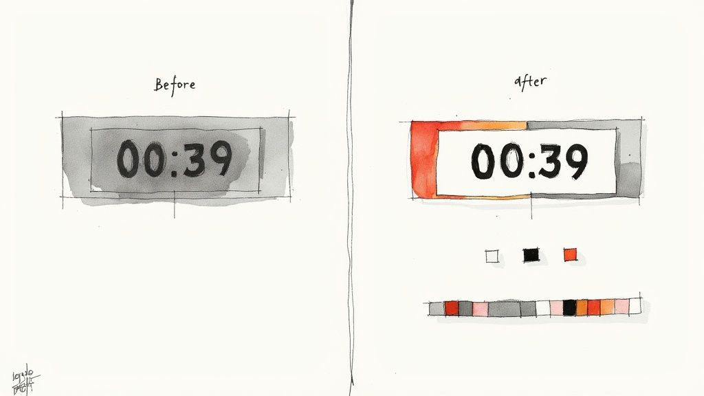
Fine-Tuning Your Color Palette
Color is a big deal—it’s one of the first things people notice. A quick win is to pull in your brand’s primary and secondary colors. Right away, this creates a visual link between the timer and your business. Easy.
But it’s not just about brand consistency; your clock has to be readable. We’ve all seen it: light gray text on a white background. It’s a classic design mistake that makes the numbers a blurry mess, especially on a phone screen. Always, always make sure there’s enough contrast between your numbers and the background.
Pro Tip: Don't just eyeball it. Use a free online contrast checker to be sure. You're aiming for a contrast ratio of at least 4.5:1, which is the standard for making sure your text is accessible to everyone.
Selecting Fonts That Speak Your Brand's Language
Fonts have personality. The font you pick for your clock is doing more than just showing numbers—it’s setting a tone. A classic serif font like Garamond can feel elegant and traditional, which is perfect if you’re launching a high-end product. On the other hand, a clean sans-serif like Montserrat gives off a modern, friendly vibe, great for something like a tech webinar.
When you're choosing, keep two main goals in mind:
- Legibility is king. The numbers need to be crystal clear. Stay away from fancy script or overly decorative fonts that make people squint to read the time.
- Stay consistent. If you have a brand style guide, use the fonts from it. This reinforces your visual identity and makes everything look polished and cohesive.
When you customize a countdown clock, the font is your brand's voice. Make sure it's speaking clearly. If you want to dive deeper into what makes a timer visually compelling, check out our guide on creating visually stunning countdowns for Facebook.
Choosing the Perfect Background
The background is the stage for your countdown, and you’ve got a few great options. A solid color background is often the simplest and most effective choice. Using one of your main brand colors creates a bold, clean look that keeps the focus right where it should be—on the numbers.
Feeling a bit more creative? Try a subtle background image. A simple texture or a relevant photo with the opacity turned down can add some depth without being distracting. Just remember that good design is about balance. Following some basic design principles for engaging visuals can make a huge difference here.
Your third option is a transparent background. This is the ultimate move for seamless integration. It lets your clock sit right on top of your website's design, making it look like a custom-coded feature instead of a third-party widget. Whatever you pick, just make sure the background supports the countdown, not competes with it.
To help you keep track of all these moving parts, here’s a quick checklist to run through as you design your clock.
Countdown Clock Customization Checklist
| Customization Element | Key Consideration | Pro Tip | | --------------------- | ------------------------------------------------------- | --------------------------------------------------------------------------------- | | Color Palette | Is there high contrast between the text and background? | Use a contrast checker to ensure a ratio of at least 4.5:1 for accessibility. | | Brand Colors | Are your primary and secondary brand colors integrated? | Stick to your style guide to maintain brand consistency and build recognition. | | Font Choice | Is the font easy to read at a glance, even on mobile? | Avoid overly decorative or script fonts that can obscure the numbers. | | Font Style | Does the font's personality match your brand's tone? | A modern sans-serif feels approachable; a classic serif can feel more premium. | | Background | Does it support the numbers or distract from them? | If using an image, lower its opacity so it doesn't overpower the text. | | Integration | How well does the clock blend with your page design? | A transparent background offers the most seamless, native-looking integration. | | Visual Hierarchy | Is the countdown the most prominent element? | Keep surrounding elements simple to ensure the timer remains the focal point. |
Using this checklist will help ensure your final design is not only visually appealing but also strategically effective, reinforcing your brand identity and capturing your audience's attention from the first second.
Getting Your Settings Just Right for Performance
A flashy timer looks great, but if the gears aren't turning correctly behind the scenes, it can create more confusion than excitement. This is where we dial in the technical settings to make sure your clock is accurate, reliable, and does exactly what you want it to when the clock strikes zero.
Getting these details right is what turns a pretty design into a powerhouse marketing tool. Things like the end date, time zone, and update frequency are the foundation of a trustworthy countdown.
Setting the End Date and Time Zone
First things first, you need to tell the clock exactly when to stop. It sounds simple, but this is where mistakes often happen, especially if you have a global audience.
When you customize your countdown clock, pay close attention to the time zone. If you're running a sale for customers all over the world, using a universal time like UTC (Coordinated Universal Time) is a smart move to keep everyone on the same page. On the other hand, if your promotion is for a specific region, lock it into that local time zone so nobody misses out because of a timing mix-up.
A little precision goes a long way here.
- For a product launch: Set the timer to end the very minute your product becomes available. This builds anticipation right up to the final second.
- For a webinar: Have the countdown end 15 minutes before you go live. It’s the perfect nudge to get those last-minute sign-ups.
This level of detail ensures every single person sees the correct deadline, no matter where they are in the world.
What's the Deal with the Update Interval?
The update interval is just a fancy term for how often the numbers on your clock refresh. Think of it as a trade-off between creating a high-energy vibe and keeping your page running smoothly.
For a flash sale that's in its final hours, a one-second interval is fantastic. That constant ticking creates a palpable sense of urgency that’s hard to ignore. But for an event that’s still weeks away, refreshing every second is overkill. A one-minute or even one-hour interval works just fine and is lighter on browser resources, making sure your page loads quickly for everyone.
Choosing the right update interval is all about context. The closer you get to your deadline, the faster the updates should be to really amplify that psychological effect of scarcity.
Defining What Happens at Zero
So, what do people see when the timer finally hits 00:00:00? Don't leave them hanging! A static, expired timer is a dead end and a huge missed opportunity. Instead, you can set the timer to perform an action automatically.
You’ve got two great options here:
- Display a Message: You can have the timer disappear and be replaced with a simple message. Something like "This offer has expired!" or "The event has started!" works perfectly.
- Redirect to a New Page: This is the real pro move. When a sale ends, why not automatically send visitors to your main products page? Or better yet, a page teasing your next big promotion?
Making a strategic choice here keeps your audience engaged and guides them on what to do next, even after the event is over. It's a small detail that makes a big difference. In fact, research shows that a well-configured countdown timer in e-commerce can boost conversion rates by an average of 21%. It makes the whole experience feel more urgent and professional.
You can learn more about how design choices build trust over at Timesact.com. By thinking through these settings, you ensure all the effort you put in to customize your countdown clock really pays off.
Putting Your Countdown Clock Out There for Everyone to See
You’ve designed the perfect countdown clock, and now it’s time for the big reveal. Getting your timer live is where all your creative work pays off, turning a neat design into a powerful tool that creates real urgency for your audience.
Whether you're looking to jazz up your website or make a splash on your Facebook Page, the process is surprisingly simple. For your website, you’ll get a small piece of code to copy and paste right into your site's HTML. Think about placing it in high-impact spots, like a homepage banner or right beside a "Buy Now" button on a product page. It’s a surefire way to grab attention.
Seamless Website Integration
Dropping your countdown clock onto your website makes it feel like a natural, built-in part of the experience. You can stick it anywhere you need a little extra nudge to get customers moving.
Our app generates a simple code snippet to make this happen. If you want a full walkthrough, check out our guide on how to embed a countdown timer on your website. It breaks down everything you need to know to get your timer up and running in just a couple of minutes.
Engaging Your Social Media Audience
You can also publish your countdown directly to your Facebook Page, which is a fantastic way to build hype for an event, a new product, or a flash sale. The timer becomes a living, breathing part of your followers' feeds, keeping your promotion top-of-mind every time they scroll.
This visual flow shows the three core settings you'll dial in before you hit publish.
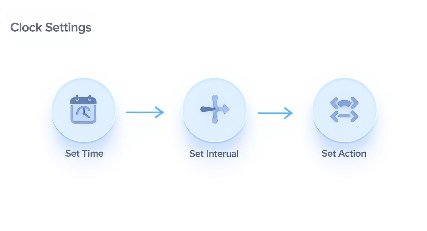 Getting these settings right ensures your timer isn't just pretty—it's also precise, triggering the right action at exactly the right moment.
Don't stop at your site and social feeds, though. Timers work wonders in other channels, too. For instance, emails with a countdown timer have been shown to get a 34% higher open rate and a whopping 29% higher click-through rate. When you use them in abandoned cart reminders, you can even recover up to 38% of those lost sales.
The Magic of Live Edits
Here’s one of my favorite features: the ability to edit your timer after it’s already live.
Imagine this: your flash sale is a huge hit, and you decide to extend it by two hours. Instead of scrambling to create and embed a new timer, you can just log into your dashboard, tweak the end time, and voilà! The timer on your website updates automatically. No stress, no tech headaches.
This flexibility is a total game-changer. It lets you adapt on the fly based on how your campaign is performing. You can change colors, push back a deadline, or alter what happens when the clock hits zero, all without missing a beat. It’s all about keeping your strategy optimized in real-time.
Common Questions About Customizing Your Clock
When you first dive into customizing countdowns, a few questions always seem to pop up. Don't worry, they're the same ones we all had when we started. Let's walk through some of the most common queries so you can get back to creating.
One of the biggest anxieties I see is the fear of hitting "publish." People worry their design is set in stone, but that's just not how modern tools work anymore. You need flexibility, especially when a campaign is already live.
Can I Edit My Countdown Clock After It's Live?
Yes, absolutely. Any good countdown tool is built for this exact scenario. You can log into your dashboard and make live edits whenever you need to.
Did the end time of your sale just change? Need to tweak the colors to better match a last-minute ad? Just hop into the editor, make your changes, and hit save. The updates will automatically push to your embedded clock everywhere it's live. No need to generate new code or mess with your website again. It's a lifesaver for making quick adjustments on the fly.
How Do I Make My Countdown Clock Look Good on Mobile?
This is a great question. The good news is that most quality countdown apps are built to be responsive right out of the box. That means they automatically resize to fit whatever screen they're on, from a huge desktop monitor to a tiny smartphone.
When you customize your countdown clock, always use the preview function. Flip between the desktop and mobile views to see exactly how it will look before you publish.
Here's a pro tip for making your mobile view pop: stick to large, clean fonts and make sure there's high contrast between your text and background. This ensures your timer is perfectly readable and still packs a punch, even on a small screen where most of your audience will probably see it.
What's the Best Update Interval for My Timer?
The right update interval really hinges on your timer's total duration. Your choice here is what dials the urgency up or down. It's all about psychology.
Here’s a quick guide I stick to:
- Short-Term Urgency: Got a flash sale ending in a few hours? A 1-second interval is your best friend. That constant ticking creates a real "act now" feeling that's hard to ignore.
- Long-Term Anticipation: Building hype for an event that's weeks away? A 1-minute or even 1-hour interval works perfectly. It keeps the event top-of-mind without feeling frantic too early on, and it's easier on your visitors' browsers.
A good rule of thumb is the shorter the countdown, the faster the update. Match the interval to the energy you want to create.
Ready to build a countdown that not only looks incredible but actually drives people to act? The Countdown Timer App has all the tools you need to design and launch a professional clock in minutes. Start for free and see what you can create.


