Create a Countdown Timer to Drive Sales
Learn how to create a countdown timer that boosts urgency and conversions. This guide covers setup, design, and advanced strategies for your website.
To really get the most out of a countdown, you first have to understand why it works. At its heart, a countdown timer is a psychological tool. It taps into some really basic human drivers, like a sense of urgency and that nagging fear of missing out (FOMO).
This simple visual cue tells your audience that an offer, event, or cool opportunity is sticking around for only a limited time and needs their attention now.
Why Countdown Timers Are a Marketing Powerhouse
Before we jump into the "how-to," it’s important to appreciate the strategic value a timer brings to the table. A ticking clock isn't just a fancy design element; it’s a powerful motivator that can seriously influence customer behavior and drive up engagement. It’s what turns passive window shopping into active decision-making.
If you're new to this, it helps to understand the basics of what conversion rate optimization is. In a nutshell, timers are a classic CRO tactic because they tackle customer hesitation head-on and encourage people to act quickly, pushing them toward that "buy now" or "sign up" button.
The Psychology of Urgency
The real magic of a countdown lies in its ability to create a sense of scarcity. When something is limited, whether by time or by quantity, its perceived value shoots up. This is a psychological trigger that’s pretty much hardwired into all of us. Just think about the hype for a big movie release; the countdown itself builds excitement and gets you emotionally invested.
You can apply this concept in so many ways, from product launches to your big annual sale:
- Flash Sales: Nothing gets people moving like a deal that ends in just a few hours. A "24-Hour Flash Sale" message paired with a live timer gives people a compelling reason to stop scrolling and start buying.
- Event Registrations: Got a webinar or a live event coming up? A timer counting down to the start date encourages people to sign up on the spot instead of putting it off for later.
- Product Launches: Big brands like Disney are masters at this. They build incredible anticipation by counting down to new park openings or parade debuts, turning the wait into a shared, exciting experience.
A well-placed timer does more than just tick away the seconds. It tells a story of a fleeting opportunity. It sends a clear message: if you want in on this, you can't afford to wait.
Real-World Impact and Scale
This idea of counting down isn't new; it's a universal human experience. We've seen it on a global scale with population milestones. It took 127 years for the world to grow from 1.6 billion to 8 billion people by 2022. Now, experts project a slower climb to a peak of 10.3 billion in 2084 before a gradual decline begins.
Even massive trends have a defined timeline, which just goes to show how powerful a fixed endpoint is.
Whether it’s for a global population milestone or a Black Friday deal, the principle is identical: a defined endpoint creates focus and motivates action. By adding a countdown timer to your marketing, you’re plugging into this powerful, universal motivator to push your own goals forward.
Launching Your First Countdown Timer
That ticking clock does more than just show time—it creates a powerful psychological trigger that nudges people to act. And the best part? You don't need to be a coding whiz to get one up and running.
Alright, you get the "why." Now for the fun part: the "how." With a tool like the Countdown Timer App, you can have a professional-looking timer live on your site or social media in just a few minutes.
Think of the app's dashboard as your mission control. It’s where every piece of your timer, from the end date to the color scheme, is just a few clicks away. Let's get your first campaign built.
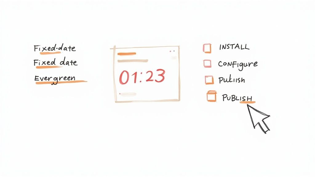
Choosing the Right Timer Type
Before you start tweaking colors and fonts, you have a key decision to make: what kind of countdown do you actually need? Your marketing goal is the deciding factor here. Generally, you'll be choosing between two main types.
- Fixed-Date Timers: These are your classic, one-size-fits-all timers. They count down to a specific, immovable date and time. Perfect for things everyone experiences together, like a holiday sale, a product launch, or a live webinar.
- Evergreen Timers: Also known as dynamic timers, these create a unique deadline for each person who sees it. The clock starts ticking the moment a visitor lands on your page or opens an email, creating a truly personal sense of urgency.
So, a Black Friday sale that ends for everyone at midnight? That's a job for a fixed-date timer. But a welcome offer that gives new email subscribers 48 hours to grab a discount? That’s where an evergreen timer shines.
Building Your First Campaign
Once you've picked your timer type, it's time to bring it to life. A good timer app will walk you through the settings without hitting you with a wall of technical jargon. The first few steps are pretty straightforward.
First, you'll set the end date and time for a fixed timer, or the duration (like 2 hours or 3 days) for an evergreen one. This is the heart of your campaign.
Next, you need to decide what happens when the clock hits zero. Should the timer just vanish? Should it redirect visitors to another page? Or maybe display a simple "Sorry, this offer has ended!" message? This step is crucial for managing expectations and keeping your site looking sharp.
Pro Tip: Never forget to configure the "after countdown" action. Leaving a timer stuck at zero looks sloppy and confuses visitors. Even a simple redirect to your homepage is a much better experience than a dead timer.
Finally, where is this timer going to live? If you’re a social media manager, you might want to publish a timer directly to a Facebook page to build hype for an event. Or, if you need more flexibility, you can grab a free website countdown timer and embed it pretty much anywhere.
With these core pieces in place, you've laid the foundation. Now you can move on to making it look great and match your brand, which we'll get into next.
Designing a Timer That Matches Your Brand
Let's be honest, a generic, out-of-the-box timer slapped onto your page just looks cheap. It can feel disjointed and completely kill the professional vibe you've worked so hard to build. To create a countdown that actually converts, you need to think like a designer and weave it seamlessly into your website's aesthetic.
This is where smart customization turns a simple clock into a powerful marketing tool. Your timer shouldn't just tell time; it should tell your brand's story and look like an intentional, natural part of your design—not some clunky afterthought.
Aligning Colors and Fonts
The fastest way to make a timer feel like it belongs on your site is by matching its colors and fonts to your brand guide. Most timer apps give you a simple color picker for the background, numbers, and labels. Don't just pick colors that look nice; pick colors that are yours.
A good rule of thumb is to use your primary brand color for the background or text, then use a secondary accent color to make the numbers pop. Contrast is everything here. If you have a dark background, use a light, bright font for the digits to make sure they're instantly readable from a distance.
Here are a few tricks I've picked up over the years:
- Use an eyedropper tool: A simple browser extension can grab the exact hex code from your logo or website header in seconds. No more guessing.
- Match your website's font: If your site uses a specific font like Montserrat or Lato, check if your timer app supports it. If not, find the closest possible alternative to maintain consistency.
- Keep it simple: Avoid using more than two or three colors. Too much visual noise just distracts from the countdown itself and looks unprofessional.
This level of detail signals to your customers that you're a professional brand that cares about the details, which is a huge factor in building trust.
Crafting Compelling Messages
Beyond the visuals, the text you pair with your timer is what gives it purpose. The countdown is a powerful visual anchor, but your message provides the context and pushes people to act. Please, don't just settle for "Offer Ends In."
Think about the customer's entire journey and customize your messages for each stage:
- Before the Countdown: Build anticipation with something like, "Our Biggest Sale of the Year Starts In..."
- During the Countdown: Create urgency with direct, benefit-driven copy. Try "Your 25% Discount Expires In..."
- After the Countdown: Don't leave them hanging! Manage expectations clearly with a message like, "This Offer Has Ended, But Check Out Our New Arrivals!" This guides users to the next step instead of just showing them a dead end.
By framing your countdown with strategic messaging, you transform it from a passive clock into an active part of your sales funnel. The timer shows when, but your words tell the customer why they should care.
This concept of time marking significant events is universal. Think bigger for a moment: the World Population Clock adds about 2.4 people to the planet every single second—a constant, global countdown to future milestones. While your sale might not be on that scale, the core principle is identical: a ticking clock commands attention. By thoughtfully designing both the look and the language of your timer, you can capture that same focused attention for your brand.
Ready to move beyond basic, one-off event timers? Let's talk about a more powerful way to automate your marketing: evergreen timers.
This is where things get really interesting. An evergreen timer creates a personalized, unique deadline for each visitor. Instead of a one-size-fits-all countdown that everyone sees, this is a dynamic tool that makes every offer feel exclusive and timely, just for the person seeing it.
The psychology behind this is incredibly effective. When a customer sees a countdown that started just for them, the urgency feels genuine and personal, not like some generic marketing gimmick. This is how you turn your automated systems into high-converting machines that work for you around the clock.
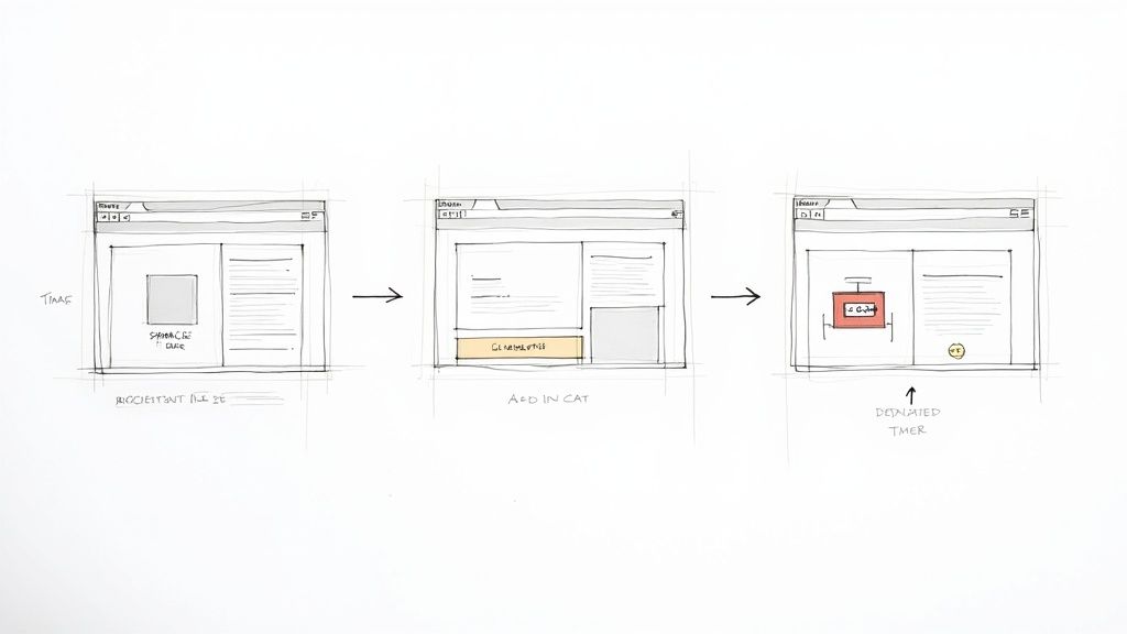
This decision tree infographic can help you quickly figure out the best timer for your campaign, depending on your goals, design ideas, and where you want to place it.
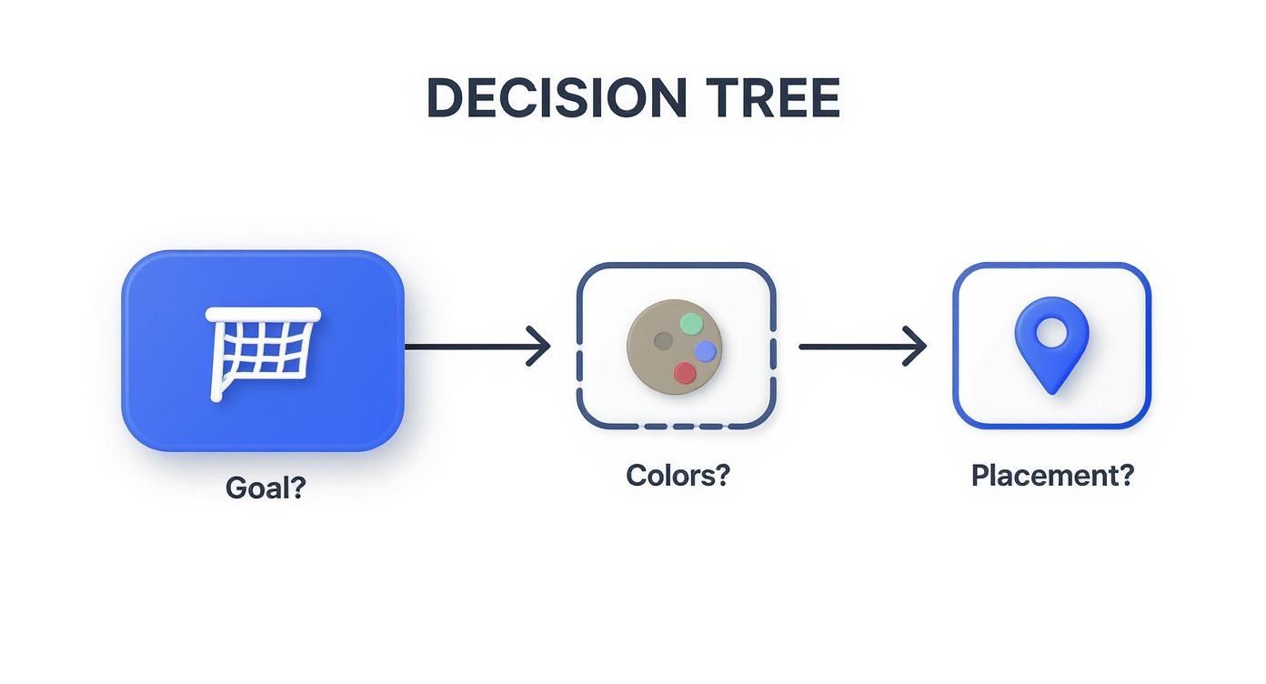
Think of it as a visual guide that walks you from your initial idea all the way to the final design choices, helping you get the biggest impact possible.
Choosing Your Timer: Fixed Date vs. Evergreen
Deciding between a fixed-date timer and an evergreen one is a crucial first step. A fixed-date timer is perfect for specific events like a Black Friday sale or a product launch—everyone sees the same deadline. On the other hand, an evergreen timer is tailored to individual user actions, making it ideal for automated marketing funnels.
Here's a quick breakdown to help you decide which one fits your needs.
| Feature | Fixed Date Timer | Evergreen (Dynamic) Timer | | :--- | :--- | :--- | | Best For | Holiday sales, product launches, live events | Welcome offers, abandoned carts, webinars | | Deadline | Same for all visitors | Unique to each visitor's first interaction | | Setup | Set a specific end date and time | Set a duration (e.g., 24 hours) | | Urgency | Creates collective hype | Creates personal, individual urgency | | Example | "Black Friday Sale Ends Friday at Midnight!" | "Your special welcome offer expires in 48 hours!" |
Ultimately, the right choice depends on your campaign's goal. If you're building buzz around a single, shared event, go with a fixed-date timer. If you want to automate personalized offers that run continuously, the evergreen timer is your best friend.
Evergreen Timers in Action
So, where do these personalized timers really shine? Their biggest strength is in automation.
Imagine someone just subscribed to your email list. With an evergreen timer, you can automatically kick off a 48-hour welcome discount just for them. This creates immediate engagement because the deadline is tied directly to their action, not some random date on the calendar.
Here are a few other killer scenarios:
- Post-Webinar Offers: After someone watches your webinar, send them to a page with a limited-time replay and a special offer that disappears in 24 hours.
- Abandoned Cart Recovery: An email with a timer saying, "Your cart and special discount expire in 3 hours!" can be the final nudge someone needs to complete their purchase.
- New Subscriber Welcome Series: Make an amazing first impression by giving new subscribers a unique discount that's only good for their first couple of days.
The real magic happens when you integrate the timer so seamlessly into your automated funnels that it feels like a natural part of the customer's journey. It stops being just another promotional tool and becomes a core part of your marketing engine.
For a detailed walkthrough on getting this all set up, check out our guide on the Countdown Timer App.
The Power of a Ticking Clock
This idea of a personalized countdown actually mirrors how we think about major global events, which often come with their own projected timelines.
For example, demographers use complex models to project population growth. The most likely scenario suggests the world's population will peak at around 11.5 billion near 2075 before slowly declining. Other models, however, show wildly different outcomes based on different factors.
Whether it’s a global forecast or a personalized discount, the principle is the same: a defined endpoint creates focus and drives action. By using evergreen strategies, you create a countdown that feels just as important and time-sensitive for each customer, leading to consistent, reliable results.
Placing Your Timer for Maximum Conversion
So, you've designed a beautiful, on-brand timer. That's the fun part. Now comes the most critical decision: where on your website will it live?
The placement of your countdown timer can make or break its effectiveness. Get it right, and it’s a conversion-driving machine. Get it wrong, and it’s just a decorative clock.
Think of it like a sale sign in a retail store. You wouldn't hide it in a back corner, right? Your timer needs to be visible, relevant, and positioned right where your customers are making decisions. The goal is to integrate it so naturally that it feels like a helpful nudge, not a pushy sales tactic.
Luckily, the technical side of how to embed a countdown timer in your website is usually a breeze. Most apps give you a simple embed code to copy and paste into your site’s HTML, whether you’re on Shopify, WordPress, or Squarespace. The real work is in the strategy.
Strategic Placement for High Impact
Where you stick your timer depends entirely on your campaign's goal. There’s no single "best" spot—context is everything. You want your timer to pop up at the exact moment a customer needs that final push to take action.
Here are the three most effective locations I've seen work time and time again:
- Top Banner or Header: This is your go-to for big, site-wide promotions like a Black Friday sale or a holiday special. Placing a timer in a banner at the top of the page grabs attention immediately and guarantees every single visitor sees the offer, no matter which page they land on first.
- On the Product Page: Got a discount on a specific product? The most powerful spot for your timer is right next to the "Add to Cart" button. This creates a potent sense of urgency at the critical point of decision, encouraging shoppers to buy now instead of "later."
- Dedicated Landing Pages: If you're promoting a webinar, a course enrollment, or a special product launch, putting the timer front-and-center on its own landing page builds incredible focus. It strips away all other distractions, making the countdown the main event.
The secret is matching the placement to the customer's mindset. A top-of-page banner creates broad awareness, while a product page timer is all about closing the deal. When you align the two, you maximize conversions.
Don't Guess—Test and Optimize
Look, you don't have to just guess what will work best. The only way to know for sure is to test different placements and see what your audience actually responds to. This doesn’t need to be some complicated, expensive endeavor.
Run a simple A/B test by creating two versions of a page, each with the timer in a different location. For example, you could test a top banner against a timer placed just below the product description. Let it run for a week, then dive into your analytics. See which version led to more clicks, sign-ups, or sales.
This data-driven approach removes all the guesswork and helps you fine-tune your strategy for the best possible results.
Your Countdown Questions, Answered
Once you've designed the perfect timer, you'll probably have a few practical questions. What happens when the clock hits zero? Can you create a unique timer for every visitor? Let's tackle the most common queries.
Getting these details right is what turns a good timer into a great one that actually drives results for your brand.
Can I Make a Countdown Unique for Each Visitor?
You bet, and it's one of the most effective ways to use a countdown. This is what we call an evergreen or dynamic timer. Instead of counting down to one specific date for everyone, it starts a fresh countdown for each person as soon as they land on your page.
This strategy is a game-changer for automated funnels or personalized welcome offers. Imagine a new subscriber getting an exclusive 48-hour discount that kicks off the moment they sign up. The urgency feels real and personal to them, making the offer that much more compelling.
You can usually find this setting in your timer's configuration. Just look for an "Evergreen" or "Dynamic" option instead of the standard "Fixed Date."
What Should Happen When the Timer Hits Zero?
Leaving a timer stuck at 00:00:00 looks sloppy and can confuse your visitors. The good news is you have total control over what happens next. You'll want to set this up before you launch.
Here are a few of the most popular and effective options:
- Make the timer disappear. This is the simplest choice. The timer and any related offer banners just vanish, returning the page to its normal state.
- Redirect visitors to another page. Perfect for ending a sale. You can automatically send anyone landing on the expired offer to your homepage or maybe a "New Arrivals" collection.
- Display a custom message. Swap the timer with a clear, helpful message like, "Sorry, you missed it! Sign up for our newsletter to hear about the next sale."
- Reveal a call-to-action button. Building hype for a product launch? You can replace the "Launching In..." timer with a shiny "Buy Now" button the second it goes live.
The goal is to create a seamless user experience. The end of a countdown shouldn't be a dead end. Instead, it should guide your visitor to the next logical step on their journey with your brand.
Will a Countdown Timer Slow Down My Website?
That's a super valid concern. We all know page speed is critical for user experience and SEO. Thankfully, most modern timer apps, including ours, are built to be incredibly lightweight and shouldn't cause any noticeable drag on your site's performance.
These tools are coded to load independently (using something called asynchronous JavaScript), so they don't block the rest of your page from appearing. Your images, text, and other key elements can load first while the timer script gets ready in the background.
Still, it's always smart to check. After installing any new app, it’s a good habit to run your site through a tool like Google PageSpeed Insights. It only takes a second and will give you peace of mind that your new timer isn't holding you back.
Ready to build a countdown that captures attention and gets people to act? With the Countdown Timer App, you can design and publish beautiful, high-performing timers for your website and Facebook page in just a few minutes. Start for free and build your first timer today!


