10 Effective Call to Action Examples That Convert in 2025
Boost your conversions with these 10 effective call to action examples. Get swipe copy for web, social, and email to drive clicks and grow your business.
A call to action (CTA) is far more than just a button on a page or a link in a post. It's the engine of conversion, the critical moment where a passive reader becomes an active lead, subscriber, or customer. Every piece of content you create, from a detailed blog post to a quick social media update, is designed to guide your audience toward a specific next step. If that final instruction is weak, unclear, or uninspired, the entire effort is wasted. A powerful CTA doesn't just suggest; it persuades, clarifies, and motivates.
This article moves beyond generic advice to provide a strategic playbook of effective call to action examples you can implement immediately. We will dissect 10 distinct types of high-converting CTAs, from low-friction entry points like "Get Started" to high-commitment actions like "Buy Now." For each example, you’ll get actionable swipe copy for social media, email, and web, along with a brief analysis of the psychology that makes it work. To begin, it's essential to understand the fundamental principles behind what makes a good CTA.
We'll also explore practical tactics, including ideal placement, visual suggestions, and ideas for A/B testing to maximize your results. A key focus will be on amplifying urgency, with specific notes on how to pair these CTAs with a Countdown Timer on Facebook or your website. This guide is your blueprint for turning clicks into conversions and transforming your marketing from simply informational to truly transactional.
1. Get Started - Low-Friction Entry Point CTA
The "Get Started" call to action is a classic for a reason: it's one of the most effective, low-friction ways to guide a user into your ecosystem. Unlike more committal CTAs like "Buy Now" or "Sign Up," "Get Started" implies the beginning of a simple, often-free process. This psychological framing is crucial for SaaS platforms, freemium services, and any business model where the initial hurdle is getting a user to take that first small step.
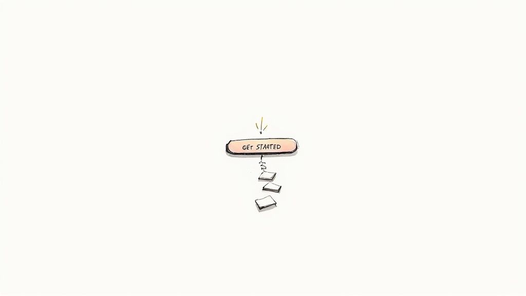
It works by minimizing the perceived effort and risk, making it an inviting entry point for new visitors who may not be ready for a purchase or full commitment. This approach is fundamental to building a strong user base from the top of the funnel.
Strategic Breakdown
- Friction Reduction: The primary goal is to lower the barrier to entry. "Get Started" feels less demanding than "Create Account," even if the next step is the same.
- Implied Value: This CTA inherently promises a solution or a benefit is just a click away. It signals the beginning of a positive journey.
- Broad Applicability: It's versatile. Whether you're offering a free trial, a product demo, or access to a free tool, "Get Started" fits perfectly.
Key Insight: The power of "Get Started" is in its ambiguity. It doesn't define the entire journey, just the first step, which makes the user's decision to click feel small and manageable.
How to Implement It Effectively
- Pair with a Clear Value Proposition: The CTA should never stand alone. Place it directly beside a headline that states the ultimate benefit, like Slack’s “Made for people. Built for productivity. Connect with your team and get started.”
- Use High-Contrast Design: Make the button pop. Use a color that stands out from your background and other page elements to draw the user's eye directly to the desired action.
- A/B Test Against Specific Alternatives: To ensure "Get Started" is the optimal choice for your audience, test it against more specific variants like "Try for Free" or "Create My Free Account." Analyze which language generates more clicks and conversions.
- Incorporate Urgency for Onboarding: When using this CTA for limited-time onboarding offers or special cohort access, pairing it with a visual timer can significantly boost engagement. You can discover more about using a Facebook countdown timer on countdown-timer.app to enhance this effect.
2. Learn More - Educational Discovery CTA
The "Learn More" call to action is a powerful tool for guiding users deeper into the consideration stage of the buyer's journey. It functions as a soft-sell, low-pressure invitation to consume more information rather than make an immediate commitment. This approach is particularly effective in B2B contexts, for high-ticket items, or for complex services where prospects need to build knowledge and trust before converting.
It works because it aligns perfectly with the user's intent at that moment: research. By offering educational content like a whitepaper, case study, or detailed feature page, you meet their needs directly. This builds brand authority and moves them down the funnel without the friction of a hard-sell CTA like "Buy Now," making it one of the most reliable effective call to action examples for nurturing leads.
Strategic Breakdown
- Aligns with User Intent: This CTA acknowledges that the user is in a research phase and provides the exact resource they are looking for, building trust.
- Reduces Decision Fatigue: It offers a simple, non-committal next step, making it easy for users to continue their journey on your site rather than leaving to find information elsewhere.
- Lead Generation Engine: When "Learn More" leads to gated content (e.g., an in-depth guide), it becomes a highly effective mechanism for capturing qualified leads.
Key Insight: "Learn More" succeeds by prioritizing education over transaction. It changes the dynamic from a sales pitch to a helpful consultation, which is crucial for building long-term customer relationships.
How to Implement It Effectively
- Deliver on the Promise: The link must lead to substantive, valuable information, not a thinly veiled sales page. Fulfilling the user's expectation for knowledge is critical to maintaining credibility.
- Provide Contextual Clues: Frame the CTA with supporting copy that specifies what they will learn. Instead of a standalone button, use text like, "See how our platform integrates with your existing tools. Learn More."
- Offer Multiple Pathways: On a features page, place a "Learn More" CTA alongside a harder CTA like "Request a Demo." This gives users a choice based on their readiness to engage, capturing both informational and transactional intent.
- Connect to Nurture Sequences: Use clicks on "Learn More" as a trigger to enroll prospects into targeted email sequences that continue their educational journey, delivering more relevant content over time.
3. Claim Your [Specific Benefit] - Ownership-Based CTA
The "Claim Your..." call to action is a powerful psychological trigger that frames an offer not as a purchase, but as something the user is already entitled to. This CTA shifts the user's mindset from "Should I buy this?" to "This is mine, I just need to collect it." This sense of ownership is crucial for lead magnets, free trials, and exclusive discounts, as it makes the action feel like a logical next step rather than a commitment.

It works by leveraging the endowment effect, where people place a higher value on things they own. By using the word "claim," you create a sense of pre-ownership, making the user more reluctant to abandon the offer. This makes it one of the most effective call to action examples for driving conversions on specific, tangible benefits.
Strategic Breakdown
- Creates Ownership: The word "Claim" implies the benefit already belongs to the user, increasing its perceived value and the motivation to act.
- Benefit-Oriented: This CTA forces you to be specific. It’s not just "Claim," it's "Claim Your Discount" or "Claim Your Free Report," which clearly communicates the value.
- Reduces Hesitation: It feels less like a transaction and more like a simple retrieval process, lowering the psychological barrier to clicking.
Key Insight: The effectiveness of this CTA comes from its personalization and specificity. Using "Your" makes it personal, and stating the exact benefit makes the value proposition impossible to ignore.
How to Implement It Effectively
- Be Explicit with the Benefit: Always specify what the user is claiming. Instead of a generic button, use phrases like "Claim Your 30-Day Free Trial" or "Claim My Free E-book."
- Pair with Scarcity: This CTA is highly effective when combined with urgency. Phrases like "Claim Your Spot Before It's Gone" or adding "Offer ends tonight" create a powerful fear of missing out (FOMO).
- Use in Retargeting Campaigns: Presenting a "Claim Your 15% Off" CTA to a user who previously abandoned their cart can re-engage them by framing the discount as a special offer reserved just for them.
- Amplify with a Countdown Timer: For time-sensitive offers like flash sales or early-bird pricing, placing a visual countdown timer next to a "Claim Your Discount Now" button can significantly increase conversion rates by making the deadline tangible and immediate.
4. Subscribe Now - Recurring Revenue CTA
The "Subscribe Now" call to action is direct and commitment-oriented, designed specifically for business models built on recurring revenue. Unlike one-time purchase CTAs, "Subscribe Now" frames the customer relationship as ongoing and value-driven over time. This approach is essential for SaaS companies, media publications like The New York Times, and membership platforms seeking to build a loyal, predictable revenue stream.
This CTA works by clearly communicating the long-term nature of the commitment. It targets users who have already been convinced of the ongoing value and are ready to invest in a continuous service, making it one of the most powerful effective call to action examples for retention-focused businesses.
Strategic Breakdown
- Clarity of Commitment: This CTA leaves no room for ambiguity. Users understand they are entering a recurring payment agreement, which helps pre-qualify leads and reduce future churn.
- Value-Oriented Framing: "Subscribe" implies gaining access to a continuous stream of content, services, or benefits, shifting the focus from a single transaction to sustained value.
- Builds Predictable Revenue: It's the cornerstone of the subscription economy, turning one-time customers into long-term patrons and creating a stable financial forecast.
Key Insight: "Subscribe Now" is successful when the perceived value of ongoing access far outweighs the friction of a recurring commitment. The decision to click is an investment in future benefits.
How to Implement It Effectively
- Be Transparent with Pricing: Always display the cost and billing frequency (e.g., "$10/month") directly next to the CTA button. This transparency builds trust and reduces cart abandonment.
- Offer a Trial Period: Lower the commitment barrier by pairing the CTA with a risk-free offer. Phrases like "Start Your 30-Day Free Trial" before asking for a subscription can dramatically increase conversions.
- Reinforce Value with Social Proof: Place testimonials or user ratings near the "Subscribe Now" button. Highlighting what current subscribers love about the service reinforces the value proposition at the critical moment of decision.
- Use Scarcity for Special Tiers: When offering a limited-time subscription discount or a founding member rate, combine the CTA with a countdown timer. This creates urgency and encourages immediate sign-ups, as seen on platforms using tools from a site like countdown-timer.app.
5. See Results / View Results - Social Proof-Driven CTA
The "See Results" or "View Results" call to action taps into a powerful psychological trigger: social proof. Instead of asking for a direct commitment, it invites users to review evidence of success. This approach is exceptionally effective for B2B services, SaaS platforms, and any high-consideration purchase where buyers need to justify their decision with concrete data and success stories from others.
This CTA shifts the focus from what the user has to do (sign up, buy) to what they get to see (proof, case studies). It builds credibility and trust by transparently showcasing your product's or service's impact. For prospects on the fence, seeing tangible outcomes achieved by similar companies can be the final nudge they need to convert.
Strategic Breakdown
- Builds Credibility: This CTA's primary function is to establish trust. It demonstrates that you have a track record of success and are confident enough to let the results speak for themselves.
- Reduces Perceived Risk: By showing how others have succeeded, you alleviate the prospect's fear of making a bad investment. It answers the question, "Will this work for me?" before they even have to ask.
- Targets Decision-Makers: In B2B sales, decision-makers need data, ROI calculations, and proof of concept. A "See Results" CTA speaks their language and provides the exact resources they need to build an internal case for your solution.
Key Insight: This CTA transforms your marketing from a sales pitch into an evidence-based consultation. You are not just telling prospects you can help them; you are showing them precisely how you have helped others just like them.
How to Implement It Effectively
- Lead with Specific Metrics: Frame the CTA with compelling data. Instead of just "View Case Studies," try "See How We Increased ROI by 250%." This specificity creates immediate intrigue and sets clear expectations for the content.
- Feature Recognizable Logos: Place logos of well-known clients near the CTA button. This visual social proof lends instant authority and makes the offer more compelling, even before the click.
- Segment Your Case Studies: If possible, direct users to results that are most relevant to them. A button like "See Results for E-commerce" is far more powerful than a generic one for a visitor from that industry.
- Keep Proof Fresh and Relevant: Regularly update your case studies and success stories. Outdated results from years ago can diminish credibility. Fresh data shows your solution is effective in the current market.
6. Book a Demo / Schedule a Call - Direct Engagement CTA
The "Book a Demo" or "Schedule a Call" CTA is a high-intent, high-commitment action designed for B2B, SaaS, and high-value service businesses. Unlike top-of-funnel CTAs, this one skips the nurturing phase and moves a qualified lead directly into the sales pipeline. It signals that a user has moved beyond initial curiosity and is actively evaluating a solution, making it one of the most valuable conversion points in a complex sales cycle.
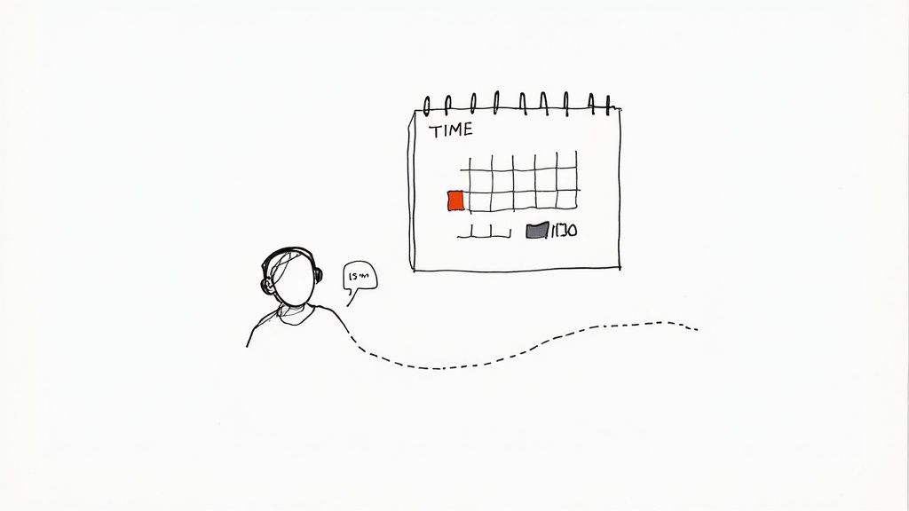
This approach works by creating a direct bridge between a prospect's problem and a personalized solution presented by a sales representative. By inviting a direct conversation, you can address specific pain points, overcome objections, and tailor your pitch in a way that a static webpage cannot.
Strategic Breakdown
- Lead Qualification: This CTA acts as a natural filter. Only prospects with a genuine need and interest will commit their time to a call, ensuring your sales team engages with high-quality leads.
- High-Touch Engagement: It shifts the interaction from passive content consumption to an active, two-way conversation, which is essential for selling complex or expensive products.
- Accelerated Sales Cycle: By getting a prospect on a call, you can significantly shorten the time it takes to move them from consideration to decision.
Key Insight: The success of a "Book a Demo" CTA relies on managing expectations. Clearly communicating the call's duration, purpose, and value beforehand reduces friction and increases conversion rates.
How to Implement It Effectively
- Specify the Time Commitment: Reduce hesitation by being upfront about the time required. Use specific language like "Book a 15-Minute Demo" or "Schedule a 30-Minute Strategy Call."
- Streamline Scheduling: Integrate a calendar tool like Calendly or HubSpot Meetings directly into the landing page. This eliminates back-and-forth emails and allows the prospect to book a time instantly, reducing friction at the final step.
- Use Pre-Qualifying Questions: Place the CTA after a brief form or chatbot interaction that gathers essential information. This pre-qualifies the lead and equips your sales team with context before the call even begins.
- Automate Reminders: Set up automated email or SMS reminders 24 hours and 1 hour before the scheduled call to drastically reduce no-show rates and ensure the prospect is prepared.
7. Download Now - Lead Magnet CTA
The "Download Now" call to action is a cornerstone of inbound marketing and lead generation. It operates on the simple principle of a value exchange: the user provides their contact information (usually an email address) in return for a valuable piece of gated content. This CTA is highly effective because it offers instant gratification and tangible value, making it a powerful tool for capturing leads who are actively seeking solutions.
This approach is perfect for businesses wanting to build their email list with qualified prospects. By offering high-value resources like ebooks, whitepapers, templates, or research reports, you attract an audience genuinely interested in your area of expertise. It moves the relationship beyond a simple website visit into a direct line of communication, opening the door for future nurturing.
Strategic Breakdown
- Value Exchange: The core of this CTA's success is the perceived value of the lead magnet. The resource must solve a specific problem or provide unique insights to justify the user sharing their personal information.
- Instant Gratification: Unlike a "Contact Us" or "Learn More" button, "Download Now" promises an immediate asset. This immediacy is a strong psychological motivator that drives action.
- Audience Qualification: The type of content you offer acts as a filter. Someone downloading a free SEO guide is likely a qualified lead for an SEO tool, making this a highly efficient way to segment your audience.
Key Insight: "Download Now" is most effective when the perceived value of the asset far outweighs the perceived cost of providing an email address. The more exclusive and helpful the resource, the higher the conversion rate.
How to Implement It Effectively
- Be Specific and Outcome-Oriented: Don't just say "Download Our Guide." Instead, use copy that highlights the benefit, such as "Download Your Free Template" or "Get the 2024 Industry Report." This clarity sets expectations and increases desire.
- Visually Represent the Asset: Create a compelling mockup of your ebook cover, a screenshot of the template, or a visual representation of the data inside. This makes the digital asset feel more tangible and valuable.
- Optimize the Landing Page: The landing page should be singularly focused on the download. Use bullet points to list the benefits, keep the form simple (name and email is often enough), and ensure the CTA button is prominent and clear.
- Add Urgency to Limited Resources: If you're offering a resource for a limited time, such as a special report or an event-related guide, pairing it with a countdown timer can significantly boost downloads. You can explore how to add a timer countdown for Facebook on countdown-timer.app to create this sense of urgency in your promotional posts.
8. Buy Now / Add to Cart - Direct Purchase CTA
The "Buy Now" and "Add to Cart" CTAs are the linchpins of e-commerce. These calls to action are direct, unambiguous, and designed for one purpose: to initiate a transaction. Unlike exploratory CTAs, these are high-intent and function best when a user has already made the decision to purchase. They represent the final, crucial step in the customer journey, turning browsing into revenue.
This CTA works by eliminating any confusion about the next step. It's the digital equivalent of taking an item to the checkout counter. For this reason, it is one of the most powerful and effective call to action examples for online stores, seen everywhere from Amazon's one-click checkout to independent Shopify stores. Its success hinges on the user's confidence in the product and the clarity of the offer.
Strategic Breakdown
- Clarity and Intent: These phrases leave no room for misinterpretation. The user knows that clicking the button is a transactional step, which filters for high-intent visitors.
- Momentum Conversion: This CTA capitalizes on peak buyer interest. When a customer is excited about a product, a clear "Buy Now" button converts that excitement directly into a sale.
- Psychological Finality: The directness of the language provides a sense of completion and moves the user decisively from consideration to ownership.
Key Insight: The difference between "Add to Cart" and "Buy Now" is subtle but important. "Add to Cart" encourages further shopping, while "Buy Now" is optimized for single-item, impulse purchases.
How to Implement It Effectively
- Use High-Contrast, Action-Oriented Colors: Make the button the most visually dominant element on the product page. Use a color that contrasts sharply with the background, like orange, green, or a bold brand color.
- Place It Prominently Above the Fold: A user should never have to scroll to find the purchase button. Position it near the product title, images, and price for immediate visibility and access.
- Surround with Trust Signals: Increase conversion confidence by placing security badges (SSL certificates), money-back guarantees, and positive review snippets near the CTA. This reassures users that their purchase is safe.
- Pair with Urgency Triggers: For sales or limited-stock items, place a countdown timer or a "low stock" warning near the button. This leverages scarcity to prompt immediate action. You can discover how to create urgency in sales on countdown-timer.app to maximize this effect.
9. Join Our Community / Get Invited - Belonging-Based CTA
Leveraging the human need for connection, the "Join Our Community" call to action taps into the powerful motivator of social belonging. This CTA shifts the focus from a transactional relationship to a relational one, inviting users to become part of a group with shared interests and goals. It is especially effective for platforms, brands, and services where user interaction and peer support are core components of the value proposition.
This approach works by framing the action not as signing up for a service, but as entering a social space. Examples like Discord's "Join our server" or Reddit's "Join community" succeed because they promise inclusion and access to a like-minded tribe, a much more compelling offer than simply creating another account. This is one of the most powerful and effective call to action examples for building brand loyalty.
Strategic Breakdown
- Social Proof and FOMO: This CTA implies an active, existing group that the user is missing out on. It triggers a fear of missing out (FOMO) and uses the group's presence as powerful social proof.
- Value Beyond the Product: It suggests the benefits extend beyond the core product or service. Users gain access to peer knowledge, support, and networking opportunities.
- Exclusivity and Identity: Using phrases like "Get Invited" adds a layer of exclusivity, making membership feel more valuable and sought-after. It helps users form an identity around the brand.
Key Insight: A belonging-based CTA is most potent when the community itself is a key feature. The promise isn't just what the brand can do for the user, but what the community can offer them.
How to Implement It Effectively
- Showcase the Community: The CTA should be surrounded by evidence of a vibrant community. Feature testimonials, user-generated content, or photos of active members to make the group feel real and inviting.
- Highlight Member-Only Benefits: Clearly state what users gain by joining. This could be exclusive content, early access to features, direct interaction with experts, or special discounts.
- Use Specific and Inclusive Language: Instead of a generic "Join Us," try "Join 10,000+ Fellow Marketers" or "Get Your Invite to the Creator's Hub." This specifies who the community is for and makes the invitation feel personal.
- Create a Low-Friction Entry: The joining process should be seamless. A complex or lengthy sign-up form can create a barrier that undermines the welcoming nature of the CTA.
10. Try for Free - Risk Reversal CTA
The "Try for Free" call to action is a powerful tool for building trust and lowering the commitment barrier, especially for products where the value needs to be experienced to be understood. It directly addresses a user's primary concern: financial risk. By explicitly stating that the initial experience costs nothing, you remove hesitation and encourage exploration. This is a cornerstone strategy for SaaS companies, subscription services, and software providers like Grammarly or Mailchimp.
This CTA works by shifting the focus from purchase to value discovery. The user isn't buying a product; they are simply agreeing to experience its benefits firsthand. This psychological shift is crucial for converting cautious prospects into engaged users who are more likely to see the product’s full value and upgrade later.
Strategic Breakdown
- Risk Reversal: Its main function is to eliminate the user's fear of making a bad purchase. The word "free" is one of the most persuasive in marketing.
- Confidence Signal: Offering a free trial signals that you are confident in your product's ability to deliver on its promises. You believe once they try it, they'll want to pay for it.
- Value-First Onboarding: It creates an opportunity to demonstrate your product's "aha!" moment during the trial period, making the subsequent upgrade an easier decision for the user.
Key Insight: "Try for Free" isn't just an offer; it's a strategic promise. It tells the user, "We believe in our product so much that we're willing to bet you'll love it enough to pay for it after you experience it."
How to Implement It Effectively
- Be Explicit and Transparent: Clearly state the terms. Use phrases like "14-Day Free Trial" or "Try Premium Free for 30 Days." If no credit card is required, make that a prominent part of your messaging, as it dramatically reduces friction.
- Optimize the Trial Experience: The goal is not just to get a sign-up but to secure a future customer. Create a robust onboarding sequence that guides users to the features that provide the most value quickly.
- Plan Your Post-Trial Communication: Don't wait until the trial ends. Send reminder emails highlighting the benefits they'll lose and present a clear, compelling upgrade offer. This nurtures the lead and maximizes conversion potential.
- Create Urgency Around the Trial's End: As the free period concludes, use a countdown timer in your emails or within the app dashboard ("Your trial ends in...") to prompt immediate action. This is a classic example of using scarcity to drive a decision. You can find out more about embedding a website countdown clock on countdown-timer.app to create this effect.
10 Effective CTAs Compared
| CTA | Implementation complexity 🔄 | Resource requirements ⚡ | Expected outcomes 📊 | Ideal use cases 💡 | Key advantages ⭐ | |---|---:|---:|---:|---:|---| | Get Started — Low‑Friction Entry Point CTA | Low — single button + simple flow | Minimal — basic UI, landing page, tracking | High click‑throughs; strong top‑of‑funnel growth | SaaS freemium, onboarding, awareness campaigns | Low barrier to entry; versatile across devices | | Learn More — Educational Discovery CTA | Low–Medium — links to content hub | Medium — quality long‑form content, analytics | Slower conversions; higher‑quality leads over time | B2B consideration, long sales cycles | Builds credibility and trust through education | | Claim Your [Specific Benefit] — Ownership‑Based CTA | Medium — dynamic copy + urgency elements | Medium — promotional creatives, timers, tracking | Strong short‑term lift; higher emotional engagement | E‑commerce promos, retargeting, limited offers | Clear benefit messaging; urgency boosts conversions | | Subscribe Now — Recurring Revenue CTA | Medium — subscription flow + billing | Medium–High — payments, billing disclosure, support | Predictable recurring revenue; higher signup friction | Subscriptions, memberships, newsletters | Clarifies commitment; drives steady revenue | | See Results / View Results — Social Proof CTA | Medium — case studies, metric presentation | Medium — research, testimonials, design | Increases trust; better conversion for high‑ticket items | B2B, services, enterprise purchasing | Reduces perceived risk via proven outcomes | | Book a Demo / Schedule a Call — Direct Engagement CTA | High — calendar integration + qualification flow | High — sales team, calendaring, follow‑up systems | High‑value conversions; faster qualification | Enterprise B2B, complex solutions, high ARR deals | Direct dialogue; strong lead qualification and close rates | | Download Now — Lead Magnet CTA | Low–Medium — gated form + delivery | Medium — asset creation, email automation | Strong lead capture; variable lead quality | Lead generation, content marketing, list building | Immediate value exchange (asset for email) | | Buy Now / Add to Cart — Direct Purchase CTA | Medium — checkout + payment UX | Medium–High — payment gateway, trust signals, fulfillment | Immediate revenue; highest direct conversion when trusted | E‑commerce, direct sales, impulse purchases | Shortest path to purchase; high conversion efficiency | | Join Our Community / Get Invited — Belonging‑Based CTA | Medium — onboarding + moderation features | Medium–High — community management, platform tools | Slower growth but high long‑term engagement | Social platforms, forums, membership networks | Leverages social motivation; builds loyalty and network effects | | Try for Free — Risk Reversal CTA | Medium — trial provisioning + onboarding flows | Medium–High — trial infrastructure, support, onboarding | Lowers acquisition friction; variable trial→paid conversion | Product‑led SaaS, freemium models, complex tools | Eliminates cost objection; enables product discovery |
Turning Examples into Action: Your CTA Strategy Blueprint
We've journeyed through a comprehensive gallery of effective call to action examples, dissecting everything from the gentle nudge of "Learn More" to the decisive push of "Buy Now." The core lesson is clear: a powerful CTA is never an afterthought. It's a strategic bridge built with intention, connecting your audience's needs directly to the solution you provide.
The most successful CTAs are not just random phrases; they are the culmination of understanding user psychology, funnel positioning, and conversion goals. The examples you've seen illustrate that specificity, clarity, and value are the pillars of a high-converting button or link. They demonstrate that the right words can transform passive interest into decisive action.
Synthesizing the Strategy: Your Actionable Roadmap
Moving from theory to implementation is the most critical step. Don't let this wealth of information become just another bookmarked article. Instead, use it to build a systematic, conversion-focused approach.
Here is your blueprint for turning these examples into tangible results:
-
Map Your Funnel: Start by auditing your current customer journey. Identify the key touchpoints on your website, in your emails, and across your social media posts. For each stage (awareness, consideration, decision), what is the single most important action you want a user to take?
-
Align CTA to Intent: Match the user's mindset with the CTA's demand. A new visitor exploring your blog is more likely to click "Download Your Guide" than "Book a Demo." Conversely, a visitor on your pricing page is primed for a higher-commitment CTA like "Get Started" or "Try for Free." Misalignment here is a primary cause of high bounce rates.
-
Craft with Precision: Move beyond generic verbs. Instead of just "Submit," try "Claim Your Free Quote." This small shift re-frames the action around a direct benefit for the user. Always answer the user's silent question: "What's in it for me?"
-
Embrace Urgency (Strategically): Urgency is a powerful motivator, but it must be authentic. Integrating a countdown timer alongside CTAs like "Claim Your Deal" or "Register Before It's Full" provides a tangible, visual reason for your audience to act now. This tactic transforms abstract scarcity into a concrete deadline, significantly boosting engagement on time-sensitive offers.
The A/B Testing Imperative
Remember that no single list of effective call to action examples can be a universal solution. Your audience is unique, and what works for one brand might not work for another. The true masters of conversion optimization understand that the insights in this article are the starting line, not the finish line.
Commit to a culture of continuous testing. Even minor tweaks can yield significant performance lifts.
- Test Verbs: "Get" vs. "Claim" vs. "Download"
- Test Specificity: "Start Your Trial" vs. "Start Your 14-Day Free Trial"
- Test Colors and Contrast: Ensure your CTA button visually pops from the page.
- Test Placement: Above the fold, within the content, or as a sticky element.
By applying these principles, you elevate your CTAs from simple buttons to sophisticated conversion tools. You create a seamless and persuasive experience that guides users confidently, reduces friction, and ultimately drives the growth your business depends on. Your call to action is the final, crucial instruction in your marketing message, so make it count.
Ready to amplify your CTAs with proven urgency? The Countdown Timer App makes it simple to add dynamic, high-impact timers to your website and social media posts, perfectly complementing the strategies we've discussed. Create your first timer for free and see how a visual deadline can supercharge your most effective call to action examples today. Countdown Timer App


