Improving Ecommerce Conversion Rates Guide
A complete guide to improving ecommerce conversion rates. Learn proven CRO strategies for UX, checkout optimization, and trust signals to increase online sales.
Improving your ecommerce conversion rate starts with a reality check: the global average sits somewhere between 2% and 4%. Instead of chasing some mythical universal number, true success comes from digging into your own data. You need to see how you stack up against your specific industry and, just as importantly, how you perform on different devices. That’s where you’ll find your biggest opportunities for growth.
Why Your Conversion Rate Is Lower Than You Think
Before we jump into tactics, let’s get on the same page and set some realistic expectations. I’ve seen so many store owners get discouraged because their conversion rate is "only" 3%, when in reality, that's a pretty solid number for most industries.
A "good" conversion rate isn't one-size-fits-all. It’s a moving target that depends heavily on what you sell, how much it costs, and what devices your customers are using to browse.
For a deeper dive into the foundational strategies that really move the needle, I highly recommend checking out these essential Top Conversion Rate Optimization Best Practices. Understanding these core principles will give you the context you need to make smart, impactful changes.
Unpacking the Averages
That 2% to 4% global average has been consistent for years, but it hides a ton of variation. If you sell low-cost, frequently purchased items, your numbers will look very different from a high-ticket store.
Just look at personal care products—they often see conversion rates as high as 6.8%. On the flip side, industries with higher price points and longer decision-making cycles, like home decor or fashion, are often lucky to break 2%. This just goes to show how much product type and price sensitivity influence shopper behavior.
To give you a better idea of where you stand, here's a look at some typical conversion rates across different ecommerce sectors.
Average Ecommerce Conversion Rates by Industry
This table gives you some benchmark conversion rates for various ecommerce industries. Use it to gauge how your store's performance compares to others in your niche.
| Industry | Average Conversion Rate (%) | | :--- | :--- | | Arts & Crafts | 4.64 | | Electrical & Commercial Equipment | 3.55 | | Food & Beverage | 3.28 | | Health & Beauty | 2.87 | | Kitchen & Home Appliances | 2.70 | | Pet Care | 2.50 | | Fashion & Apparel | 1.83 | | Luxury & Jewelry | 1.48 |
Remember, these are just averages. Your goal is to improve your numbers, not necessarily to match a completely different industry's benchmark.
Don't beat yourself up if your furniture store's 1.5% conversion rate doesn't match a skincare brand's 6%. Focus on improving your baseline. That's what matters.
The Critical Mobile Gap
One of the most significant—and often overlooked—factors dragging down conversion rates is the gap between desktop and mobile performance. This infographic paints a very clear picture.
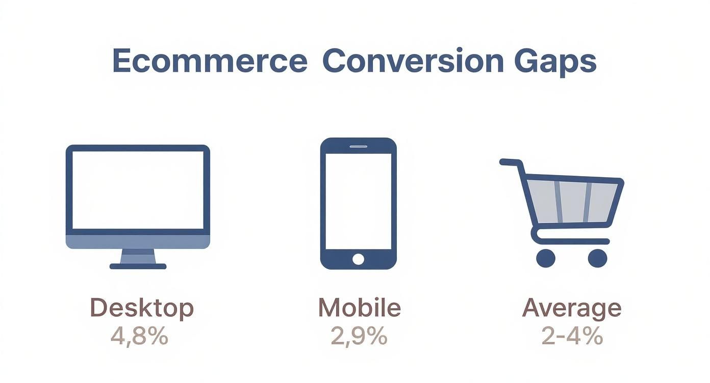
The data tells a stark story: even though most of your traffic is probably coming from smartphones, desktop users are way more likely to actually buy something.
Desktops convert at an average of 4.8%, which is nearly double the 2.9% we see on mobile. This "mobile gap" isn't a fluke. It exists because countless online stores are still clunky and frustrating to use on a small screen. We’re talking slow load times, tiny buttons you can’t tap, and checkout forms that are impossible to fill out.
Fixing these friction points is no longer optional. For most businesses, it's the single biggest opportunity you have for lifting your overall conversion rate.
Turning Product Pages Into Sales Engines
Think of your product page as the final handshake before a customer commits. It's the critical moment where a casual browser decides to become a buyer. Every single element on this page either builds confidence or sows seeds of doubt. Honestly, optimizing this one page is one of the fastest ways to see a real lift in your conversion rates.
The absolute foundation of a killer product page? Imagery. Shoppers can’t touch or feel your product online, so your photos and videos have to do all the heavy lifting. Don't stop at the sterile, white-background shots. Yes, they're essential, but they don't tell the whole story.
You need to include lifestyle photos that show your product in a real-world context. Selling a backpack? Show it on an actual hike. A coffee mug? Show someone enjoying a cozy morning with it. These images are powerful because they help customers visualize the product in their own lives.
Crafting Descriptions That Sell Benefits
Once you’ve grabbed their attention with stunning visuals, your product description needs to close the deal. So many stores make the classic mistake of just listing dry specs and features. The trick is to translate those features into tangible benefits.
Don't just say, "Made with 100% merino wool." Instead, try: "Stay warm without the itch, thanks to ultra-soft merino wool that naturally regulates your temperature." You're directly answering the customer's unspoken question: "What's in it for me?"
Structure your descriptions for people who scan (which is most of us):
- Kick things off with a compelling opening sentence that hooks the reader.
- Use bulleted lists for key benefits—they're incredibly easy to digest.
- Tuck the nitty-gritty specs into an expandable section so you don’t overwhelm the main view.
This approach respects your customer's time while still giving them all the details they need to make an informed decision.
A great product page doesn't just list features; it tells the story of how the product will improve the customer's life. Focus on the transformation, not just the transaction.
Leveraging the Power of Social Proof
Even with perfect photos and persuasive copy, shoppers still crave external validation. This is where social proof becomes your best friend. Placing customer reviews, ratings, and user-generated content (UGC) right on the page is non-negotiable.
Displaying the star rating directly below the product title instantly builds trust. A dedicated reviews section, especially one with photos from actual customers, is even more powerful. It provides authentic, unbiased proof that your product delivers. A great way to get a steady stream of UGC is to encourage customers to share photos with a specific hashtag.
Finally, your call-to-action (CTA) button needs to be impossible to miss. Use a contrasting color that pops off the page and stick with clear, action-oriented text like "Add to Bag" or "Buy Now." Sometimes, all it takes is one final nudge. Adding a simple countdown timer for a limited-time offer can create just enough urgency to turn a browser into a buyer. If you want more ideas on that, check out our guide on how to add a countdown timer to a webpage.
Building the Trust That Closes Sales
Every single person who lands on your site shows up with a bit of healthy skepticism. It's just human nature. Before they even dream of typing in their credit card number, you've got to earn their trust. This isn't about flashy design; it's about building a solid foundation of credibility that makes them feel safe.
When it comes to boosting conversion rates, it often boils down to answering one silent question your customers are asking: “Can I trust this store?” You answer that question through dozens of small cues, starting with the absolute basics of security.
An SSL certificate—that little padlock in the browser bar—isn't just a nice-to-have anymore. It’s the bare minimum. Without it, you're essentially shouting that your site isn't secure, which is a guaranteed way to kill a sale before it even starts.
You should also make your security badges from providers like McAfee or Norton easy to spot. Placing them in your site's footer and on the checkout page acts as a visual shortcut, instantly telling shoppers you take their data security seriously.
Transparency Is Your Best Policy
Beyond the technical stuff, shoppers need to feel good about your business practices. This is where transparent, easy-to-find policies can make a world of difference. A lot of purchase anxiety comes from not knowing what happens after the buy button is clicked.
What if the shirt doesn’t fit? What if it shows up broken? Your shipping and return policies need to be crystal clear and accessible from every page, not buried three clicks deep in an FAQ section.
- Shipping Policy: Be upfront about shipping costs, delivery timelines, and whether you provide tracking information. Surprise shipping fees at the last second are one of the biggest reasons people abandon their carts.
- Return Policy: Clearly lay out the return window (e.g., 30-day returns), explain the process, and state who covers the shipping cost. A truly hassle-free policy can be the final nudge a hesitant customer needs to feel confident.
A clear, customer-friendly return policy doesn't just reduce risk for the shopper; it shows you stand behind your product. That confidence is contagious and has a direct impact on your conversion rate.
Part of building this confidence also involves assuring them their transaction is safe from start to finish. You can get a deeper understanding of effective ecommerce fraud prevention and see the strategies that protect both you and your customers.
Prove There's a Human on the Other Side
Finally, nothing builds trust quite like knowing there's a real person ready to help. If your customer support is hard to find or, worse, non-existent, it just screams "scam." Making it incredibly easy for customers to reach you is one of the most powerful trust signals you can send.
A live chat widget is a fantastic tool for this. It offers immediate help and reassures shoppers that if they run into a problem, help is just a click away. Even if they never use it, just seeing it there provides a ton of peace of mind.
Similarly, a visible phone number and a business email address reinforce that you are a legitimate, reachable business that actually cares about its customers.
Fixing the Leaks in Your Checkout Flow
So, you’ve done the hard work. Your product pages are compelling, your trust signals are on point, and shoppers are eagerly adding items to their carts. But if those carts aren't turning into sales, you’ve got a leak. And more often than not, the checkout flow is where your funnel is gushing profits.
The numbers are pretty eye-watering. The global average cart abandonment rate hovers at a staggering 71.3% as of 2025, and it gets even worse on mobile, climbing to 77.2%. Think about that: more than seven out of every ten shoppers who decide they want your product will bail before handing over their money.
The reasons are almost always rooted in friction—unexpected costs, a complicated process, or being forced to create an account. It's a massive problem, but also a massive opportunity. As you can see from these ecommerce benchmarks from Speed Commerce, even tiny improvements here can deliver huge returns.
Remove Unnecessary Obstacles
Want to plug the biggest leak in your checkout, fast? Stop forcing people to create an account. This is a conversion killer, plain and simple. A first-time buyer isn't ready for a long-term relationship; they just want to buy your thing.
Offering a prominent guest checkout option is non-negotiable. It shows you respect their time and instantly removes a huge psychological barrier to purchase.
Once you've done that, turn a critical eye to your checkout form. Every single field you ask a customer to fill out is another tiny hurdle, another reason for them to second-guess their purchase. You need to be ruthless here.
- Kill the optional fields: Do you really need their phone number? What about their company name? If it's not essential for the order, get rid of it.
- Use address auto-fill: Tools that suggest and complete addresses are a lifesaver. They save time, reduce annoying typos, and just make the whole process smoother.
- Keep it short and sweet: A multi-step checkout can feel less intimidating than one long page, but aim for no more than three or four steps. Critically, add a progress bar so people know exactly where they are in the process and how much is left.
Eliminate Last-Minute Surprises
Nothing torpedoes a sale faster than an unexpected cost popping up on the final payment screen. It feels like a bait-and-switch. Your customer has already mentally committed to a price, and suddenly seeing a higher total from taxes or shipping fees creates instant distrust.
Transparency is everything here. Be upfront about all costs, especially shipping. Show them right on the product page or in the cart summary. If you offer free shipping over a certain amount, make that incredibly clear and maybe even add a progress bar to nudge them toward a slightly larger order.
By the time they hit that "Pay Now" button, the total should be exactly what they were expecting. No surprises.
Let's break down the most common reasons people leave and what you can do about them.
Top Cart Abandonment Reasons and Solutions
The reasons people abandon carts are surprisingly consistent across the board. The good news is that the solutions are often straightforward fixes you can implement right away.
| Abandonment Reason | Actionable Solution | | :--- | :--- | | Unexpected Shipping Costs | Display shipping fees upfront or use a site-wide banner to promote free shipping thresholds. | | Forced Account Creation | Prioritize a visible guest checkout option and allow account creation after the purchase is complete. | | Long, Confusing Forms | Cut down form fields to the absolute essentials and enable address auto-complete features. | | Payment Security Concerns | Prominently display trust badges for SSL, Norton, McAfee, and accepted payment methods like Visa and PayPal. |
Tackling these common pain points head-on will not only reduce your abandonment rate but also build the kind of trust that turns one-time buyers into repeat customers.
Using Urgency Without Making Customers Mad
There’s a fine line between a helpful nudge and an aggressive shove. When you get it right, urgency and scarcity can seriously boost conversions by tapping into our natural fear of missing out (FOMO). But when you get it wrong, these tactics come across as cheap tricks that just annoy people and kill trust.
The secret is to keep it real. You want to create genuine excitement, not manufactured anxiety. Instead of some generic timer that magically resets every time someone lands on the page, focus on real-world limits that actually help the customer make a decision. Think of it less like pressure and more like helpful context.
Nailing this approach is how you improve your conversion rates without trashing your brand's reputation. It shows you respect your customers' intelligence.
Creating Real Scarcity and Urgency
The most effective urgency tactics are always grounded in reality. They're about informing the customer about a real situation, which lets them make a better, more timely choice. This is where you can be persuasive and helpful at the same time.
Here are a few ethical strategies that actually work:
- Low-Stock Alerts: A simple message like "Only 3 left in stock!" is incredibly powerful because it’s tied to real inventory data. It creates a natural sense of scarcity and nudges people to act now without being dishonest.
- Limited-Edition Drops: Announcing a product that’s only available in a small batch or for a short time builds genuine hype. This strategy works wonders for building a loyal community that can’t wait to see what you release next.
- Sale Countdown Timers: A visual countdown timer is an absolute must for a real flash sale or holiday promotion. Seeing the seconds tick away makes the deadline feel tangible. If you’re driving traffic from social media, you can even create a countdown for a Facebook post to keep the message consistent.
The goal is to make the shopper feel smart for acting quickly, not tricked into a hasty purchase. Authentic urgency empowers your customers by giving them the info they need to grab a great deal before it’s gone.
When your tactics are based on real-world constraints, you don’t just encourage a sale—you also prove your brand is transparent and trustworthy. That’s how you build the kind of customer loyalty that outlasts any single flash sale.
Making Smarter Decisions with A/B Testing
Stop guessing what your customers want and start asking them—with data. That’s the whole idea behind A/B testing, also known as split testing. It’s a straightforward way to improve your conversion rates by comparing two versions of a webpage to see which one actually performs better.
This simple process takes all the assumptions out of your strategy. Instead of debating with your team over what you think will work, you let real user behavior guide your decisions.
The whole thing kicks off with a clear hypothesis grounded in your analytics. For instance, if you notice tons of people are dropping off on your product pages, you might come up with something like this: “Making our free shipping threshold more prominent will reduce hesitation and increase add-to-carts.” Just like that, your test has a clear purpose.
What Elements Should You Test?
You can test almost anything on your site, but some changes deliver much bigger wins than others, especially when you're just starting out. I always recommend focusing on the high-impact areas that directly influence a customer's decision to buy.
Consider these high-impact test ideas to get the ball rolling:
- Call-to-Action (CTA) Buttons: Experiment with the text ("Add to Bag" vs. "Buy Now"), color, and placement.
- Product Page Headlines: Test benefit-driven headlines against more feature-focused ones.
- Shipping Offers: Compare how a bold free shipping banner performs against a discount code offer.
Even seemingly small tweaks can have a massive effect. I once saw a client boost their add-to-cart rate by a whopping 15% just by changing their CTA button from a muted gray to a vibrant orange that matched their brand's energetic vibe. It was a simple fix that paid off big time.
A/B testing isn't about finding one "perfect" version of your site that you'll never touch again. It's about building a system of continuous, data-backed improvement that adapts to your customers' needs over time.
For more complex tests that involve dynamic elements, you could see how a customizable countdown clock in version A compares to a static promotional offer in version B. There are plenty of beginner-friendly tools out there like Google Optimize or VWO that can help you set up and analyze these tests without needing a developer. They essentially turn your store into a powerful conversion lab.
Answering Your Top Ecommerce Conversion Questions
When you're deep in the weeds of conversion optimization, a lot of questions pop up. I get it. Let's tackle some of the most common ones I hear from store owners trying to get their numbers up.
What Is a Good Ecommerce Conversion Rate?
Everyone wants to know the magic number, but the truth is, a "good" conversion rate is a moving target. If you're looking for a general benchmark, something in the 2% to 4% range is considered solid across the board.
But that's just an average. It gets way more specific. Niche markets like personal care can sometimes see rates as high as 6%, while stores selling big-ticket items like furniture might realistically hover around 1-2%.
The number that really matters isn't how you stack up against an industry average. It's whether you're beating your own numbers from last month. That's the real sign of a healthy, growing business.
How Long Does It Take to See CRO Results?
This one depends entirely on two things: your traffic and how big of a change you're making.
If you have a high-traffic site, you could test something simple—like changing the text on a button or tweaking a headline—and get statistically significant results in just a couple of weeks. On the other hand, bigger projects like a full checkout redesign will naturally take longer to build and test properly. You need to let enough data roll in to be confident in the outcome.
The key is to think in terms of consistent, small wins. Chasing one magic bullet solution usually ends in frustration.
What Change Has the Biggest Impact on Conversions?
If I had to pick just one area, it would be the checkout process. Hands down. With cart abandonment rates sitting at a staggering 70% on average, this is where most of the friction—and the biggest opportunity—lies.
Think about it. This is the final step where you can lose a sale. Simple fixes like adding a guest checkout option, cutting down the number of form fields, and being upfront about all costs can have an immediate and massive impact. You can literally recover sales that were about to slip through your fingers.
After you've plugged the leaks in your checkout, the next highest-impact areas are almost always your product page imagery and social proof.
Should I Focus on Mobile or Desktop Optimization First?
Mobile. No hesitation.
Yes, desktop conversion rates are often technically higher, but that statistic is misleading. The vast majority of your traffic—the initial window shopping, the product discovery, the brand's first impression—is happening on a smartphone.
Fixing the classic mobile friction points like slow load times, tiny buttons, and clunky forms will have a much bigger ripple effect across your entire business. That "mobile gap" is where most stores find their largest pool of untapped revenue.
Ready to turn that traffic into sales? Countdown Timer App makes it easy to add urgency to your sales and events with simple, effective timers for your site and social media. Start for free and watch your conversions climb.


